What’s Happening Today?—The Museum Calendar Gets Upgraded
If you’ve checked out the Museum’s calendar in the last twelve hours or so, you may have noticed how different (or, really, how not different) it is. That’s right, our calendar now looks like it fits with the rest of our Web site.
Remember what our old calendar looked like? Let’s give it one last hurrah:
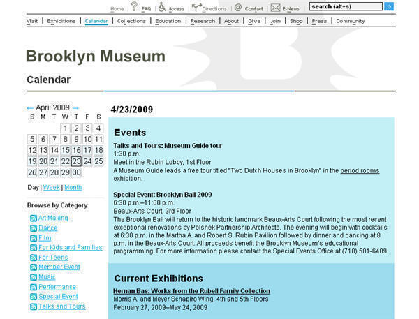
Starting today, we are rolling out some calendar upgrades to improve ease of use and allow us to disseminate event information more flexibly. Today I mainly want to talk about ease of use.
The Museum’s calendar actually has two distinct sets of users. On the front end we have visitors to our Web site (and, hopefully, to the Museum itself). But behind the scenes, our ever-patient editors comprise another group with very different needs. We tried to keep the user experience of both visitors and editors in mind over the course of the calendar upgrade.
What’s new for visitors
Many things, big and small. Let’s start with the big stuff:
New layout
We switched to a wider layout and ditched those blocks of color. And, on pages that display a range of dates (like the week, month, and weekend views and the “browse by category” pages), we’ve now grouped the events under easy-on-the-eyes date headings. No more “2009-04-18” above each and every event title. Suddenly the calendar is readable! I’m hoping this will encourage people to stay and explore what we have to offer.
Featured events
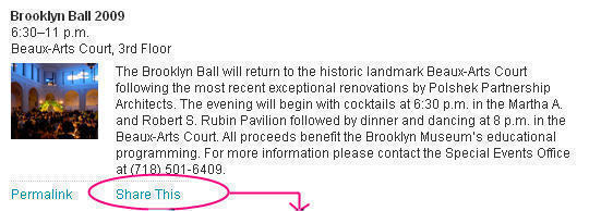
With the switch to the wider layout we were also able to add a right-hand column that we’ll use to highlight upcoming featured events, such as the Brooklyn Ball coming up on April 23.
Permalinks and bookmarking tools
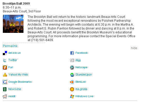
Every event now has its own permalink, to display that event and only that event. This opens up a lot of new territory for how and where we use event information. And for how you can use our event information. Taking a tip from the good folks at the Walker Art Center, we’ve added a “Share This” link below each event that lets you post it to Facebook, tweet it, or save its permalink page to a variety of social bookmarking services.
And now the small stuff. With a data-driven page like the calendar, the devil truly is in the details. These are the kind of things that individually, ultimately, should be almost invisible to anyone looking at the page, but that work together to make things feel natural. Effortless reading is what we’re aiming for here.
So, for instance, we made sure times were formatted to read the way we would say them out loud: 6—8:30 p.m. instead of 6:00 p.m.—8:30 p.m.. We moved query-specific information from its old spot at the top of the page’s main well into the page title, and programmed the titles to use more English and fewer dates. Instead of saying “Events from 4/12/2009 to 4/18/2009” we now say “Week of April 12, 2009”.
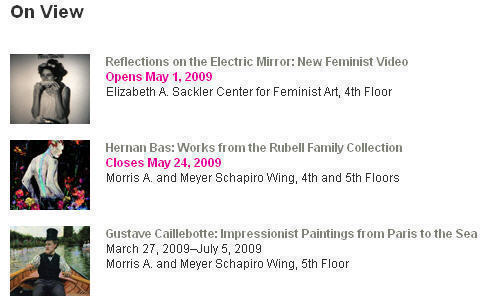
We’ve tweaked the listing of current exhibitions to call out which events are opening and closing during the requested date range, and changed the heading on that exhibition list from “Current Exhibitions” to “On View” to reinforce the fact that the list shows what exhibitions will be open during the selected time period.
What’s new for editors
Okay, technically, it’s been about week since we finalized upgrades to the intranet tool that our editors use to manage all this event information. But I think they’ll agree that it still feels new enough to merit mentioning here.
For them, the biggest change is that the new calendar tool offers a way to batch edit groups of recurring events, like Museum Guide tours, that are offered at many different times. We also integrated some related tools for managing our lists of locations and event categories. And finally, we reorganized the main page of the calendar tool to make it easier to find the events they need to edit. All of these changes should make calendar updates go more smoothly for them.
Finally, I’ll note that the new tool was designed as an alternate interface for the same underlying data that the old tool worked off of. Of course, we added significantly to the original data structure, but we were able to keep the core unchanged. Essentially, the old tool then offered access to a subset of the data and functionality that the new tool could handle. This meant that both tools could be used simultaneously — I could use the new tool for development and testing while the editors continued to use the old tool. And it meant no data migration before launch. Which is a thing of beauty.
So, that’s it. Welcome to the new calendar. Now go explore.

Jen has been a prorammer at the Brooklyn Museum since 2006. Before coming to the Museum, she did statistical programming and data management at Princeton, Columbia, and UMDNJ. She has a degree in economics from The College of New Jersey.
