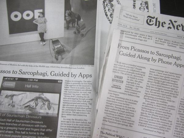
A Response to Rothstein’s “From Picassos to Sarcophagi, Guided Along by Phone Apps”
Many of you may have seen Edward Rothstein’s assessment of mobile technology in museums, but if you haven’t it is certainly worth a read and a bit of discussion. The article looks at our mobile application along with the Museum of Modern Art and the Museum of Natural History and Rothstein pretty much dislikes the state of the union across the board.
I had mixed feelings about the article—I mostly agree that these apps all leave much to be desired, but I disagree that we shouldn’t be trying. Experimentation without perfection is a good thing. You may remember, I have my own issues with the use of technology in museums, had a less than stellar experience using the AMNH Explorer app and we’ve had to rework our own mobile app once already. Now is a good time to look at what the author is saying and discuss the current state of our mobile application.
One of the things Rothstein brings up is the lack of geolocation in our app. He wants the device to automatically locate where he’s standing and magically deliver content—don’t we all? We have GPS and AMNH’s Explorer app to thank for setting the bar so high, but in terms of what we can do here in Brooklyn, it’s just not possible yet. While we do have a museum-wide wireless system, it was put in during 2004 and we don’t have the meshing technology required to triangulate signal (something that would require replacing the existing wireless network in its entirety), so we rely on people’s use of accession numbers to look up information about objects. This is not perfect by any means, but it’s the simplest, clearest and most sustainable way we’ve come up with to deal with the nearly 6000 objects on view. We tried other methods in version 1 of our app to no avail and we’ve considered switching to QR codes or short numeric codes, but that’s not realistic for this many objects. Given every object has a unique number published on the object label and we need to develop a system that works with every object on view, accession number lookup is the way to do it…at least for now.
Rothstein makes an assumption about low usage of our app and this is true in some ways, but not true in others. First and foremost, we don’t have a large audience for our app. In the galleries on any given day (especially Target First Saturday), you’ll see very few visitors pulling out smartphones. Eventually, that will change and it’s important to have a system in place as we start to see this turn around, but for now we are consistently seeing clamshell phones on cheaper monthly plans. Beyond this, our app has suffered from poor visibility throughout the building. I will admit that I’m really jealous of the amount of visibility the AMNH app—big signage everywhere, staff have Explorer t-shirts and ads are seemingly all over the place—as simply as I can put this: I want.
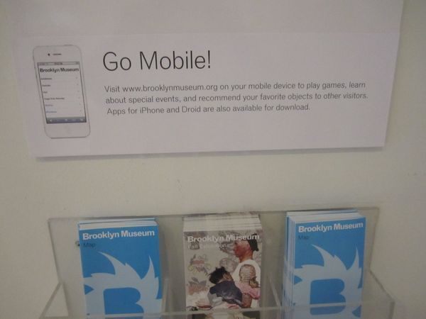
Just recently, we managed to get directory signage better positioned and our designers are helping us by including a picture of the iphone. We saw a slight rise in usage when the signage went in, so that’s helping a bit.
So, let’s take a look at what’s really happening when people use this. The statistics are indicating that they are doing so for pre-visit information (directions, hours, exhibitions, calendar) and that’s something that closely mirrors our general website traffic patterns. It’s not that visitors are trying to use BklynMuse (our collection search) and failing or trying to play Gallery Tag! (our gallery game) and giving up—they are not getting that far. This could indicate two things: 1) that visitors want to use the application pre-visit, but they don’t want it to be part of their in-gallery experience and/or 2) our app’s home screen is not clear enough to explain all the choices available. For our next round of changes, we are going to concentrate on the latter and see if that changes the metrics.
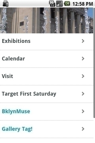
What in the world do I get behind doors labeled BklynMuse and Gallery Tag? It’s just not clear.
Where Rothstein’s assumption falls really short is what happens when people use BklynMuse. What we are seeing in the statistics indicates that when people are using it, they are using it in an interactive way. When you compare visitor’s use of the “Like This” feature in-gallery to the collection online, what you see is that on the whole, people in the gallery are using this feature to recommend objects to other visitors. So, in theory, this kind of recommendation layer where we directly ask people to help guide others is working—we just need to do a better job getting people to the feature.
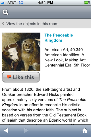
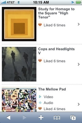
Low usage overall? Yes, but “Like this” feature is being utilized in the gallery more than on our website.
Rothstein goes on at length to talk about why none of these apps measure up to the experience he wants in the gallery and there’s a point to that. Each and every visitor walking in our doors is likely to expect something different from an app and every visitor is going to respond differently to what we provide. My point is that it is our responsibility, collectively, to try new approaches and provide as many entry points into content and the museum as possible. In terms of Brooklyn’s people-focused mission, we believe a people-focused application is the way to go. The curated content is already on the walls in the form of object installation, labels and didactics, in-gallery multimedia and gallery design. The power of the device means we can provide something else, something more unique. We believe leveraging the power of our visitor’s voices in combination with our own is a worthy goal. Are we there yet? No. Should we try, discuss, learn from our visitors and continue to iterate? Yes, yes, yes.
I’d love to discuss more via the comments. There’s a lot to cover on this subject, that’s for sure.

Shelley Bernstein is the former Vice Director of Digital Engagement & Technology at the Brooklyn Museum where she spearheaded digital projects with public participation at their center. In the most recent example—ASK Brooklyn Museum—visitors ask questions using their mobile devices and experts answer in real time. She organized three award-winning projects—Click! A Crowd-Curated Exhibition, Split Second: Indian Paintings, GO: a community-curated open studio project—which enabled the public to participate in the exhibition process.
Shelley was named one of the 40 Under 40 in Crain's New York Business and her work on the Museum's digital strategy has been featured in the New York Times.
In 2016, Shelley joined the staff at the Barnes Foundation as the Deputy Director of Digital Initiatives and Chief Experience Officer.

