Split Second Stats #7: Contentiousness
A big part of experiencing art is talking about it. Sometimes (or, uh, frequently) artworks are successful because they provoke disagreement, and along with that disagreement, some good conversation. Because the participants in the Split Second online experiment weren’t communicating with one another, we didn’t get an opportunity to measure conversations about the artworks directly. However, we did want to get a sense of which works might be contentious, and to make an effort to figure out why.
To measure contentiousness, we looked at the variance of the ratings for each work. If most participants gave a work roughly the same rating, then it’s safe to say that work is not contentious. However, if participants disagree, if there’s a large amount of variance in the ratings, then that work might be contentious. (I say “might” for a good reason: while high variance of ratings may indicate disagreement, it could also simply indicate confusion. I’ll come back to this later.)
In Split Second Stats #4: Engagement we found that certain tasks in the experiment had a strong effect on the variance of ratings. This is important because it indicates that the context of presentation and the way participants engage with a work can change the variance. Here, however, we’ll take a look at how variance and contentiousness were related to specific properties of the works themselves. All of the analyses below apply to the unlimited time experimental tasks only.
As in many of the analyses described in previous blog posts, complexity played a big role here. We found that as paintings got more complex, they became less contentious. That is, we found a negative correlation between complexity and variance (cor = -.35, p = 0.03). This is not too surprising: we found previously that when time was unlimited, people tend to rate complex paintings very well, a finding which already implies inter-participant agreement. A more puzzling finding concerned color: The higher the overall saturation of the colors in a work, the higher the variance (cor = .42, p < 0.01). One possible, but entirely speculative, explanation for this effect is that one large group of our participants reacted very positively to highly saturated color palettes, which another large group reacted very negatively. Similarly, we found that the larger the frame of the painting, the more variance in ratings. This again might suggest (speculatively!) a division of the participant population into two groups: those that found large frames interesting, and those that found them to get in the way of the work.
Some of the strongest effects concerning variance were not clearly related to quantifiable properties of the works themselves. One very strong, reliable finding was that as the average amount of time participants spend looking at a work increased, the variance of the ratings of that work decreased (cor = -.47, p = 0.002). That is, the more time was spent looking at a work, the more our participants tended to agree about how to rate it. Though this finding seems to push against the gist of the thin slicing theory, it also seems like an encouraging experimental result: in order to get people to agree about art, you just need to get them to hold still and look at it for a long time. However, it’s a little bit more complicated than that. People decide for themselves whether or not they want to spend a long time looking at an artwork. This finding lets us know that when our participants spent that time, they tended to agree, but it doesn’t tell us why they decided to spend their time in the first place. There is also a cause-and-effect problem: it could be that the decreasing variance and the increasing time are themselves caused by a third factor we didn’t measure. (Though complexity looks like it may account for some of this effect, it certainly doesn’t account for all of it.)

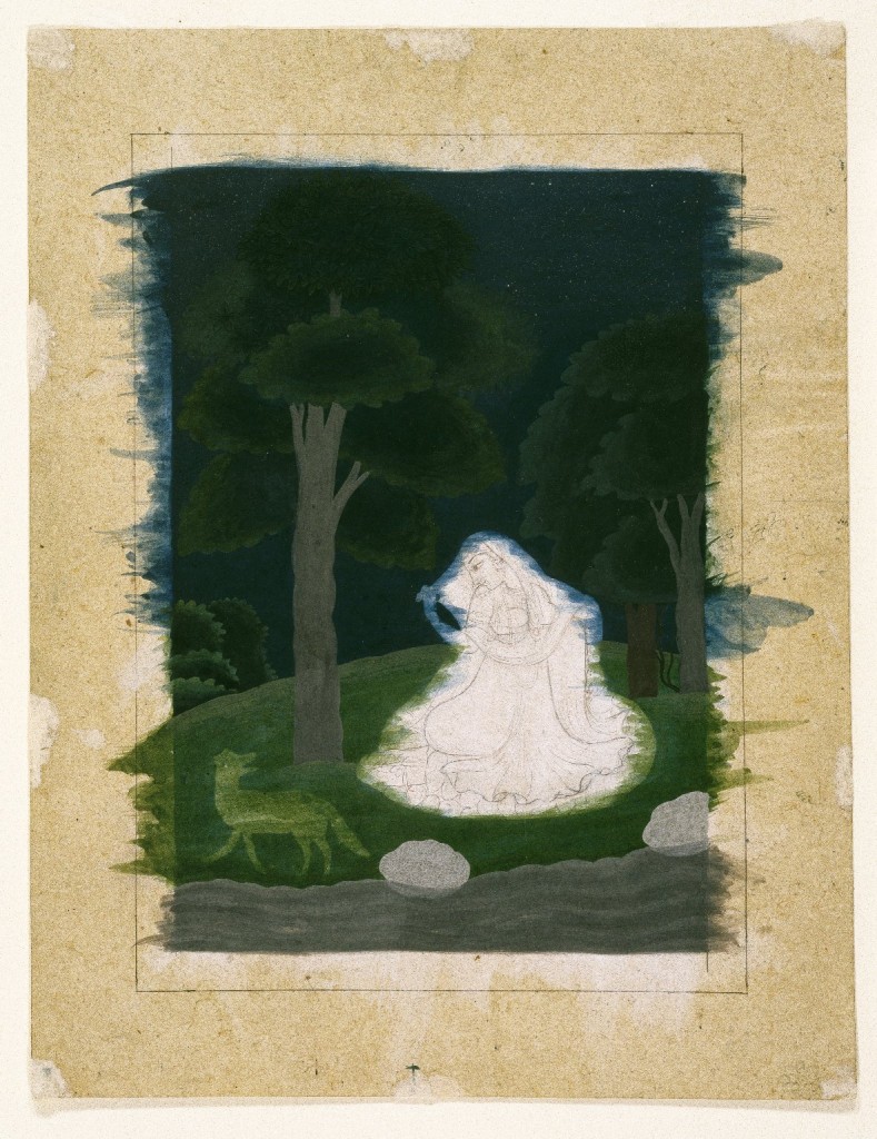
Indian. Utka Nayika, late 18th century. Opaque watercolor on paper, sheet: 9 13/16 x 7 9/16 in. (24.9 x 19.2 cm). Brooklyn Museum, Gift of Dr. Ananda K. Coomaraswamy, 36.241
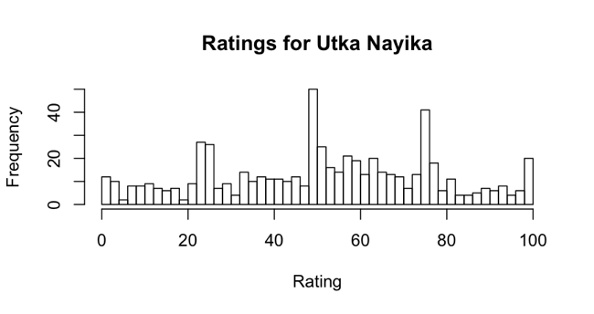
Finally, we found that some of the works in the experiment were simply contentious on their own terms. The most contentious object, Utka Nayika (pictured above), is unfinished. Though we have no quantifiable measure that points toward it being an unfinished work, it seems like a safe bet that this peculiarity accounts for the high variance in participants’ ratings. As I mentioned before, it’s important to differentiate between contentiousness and confusion. We can identify this work as being truly contentious, and not simply confusing, by looking at a histogram showing how it was rated.

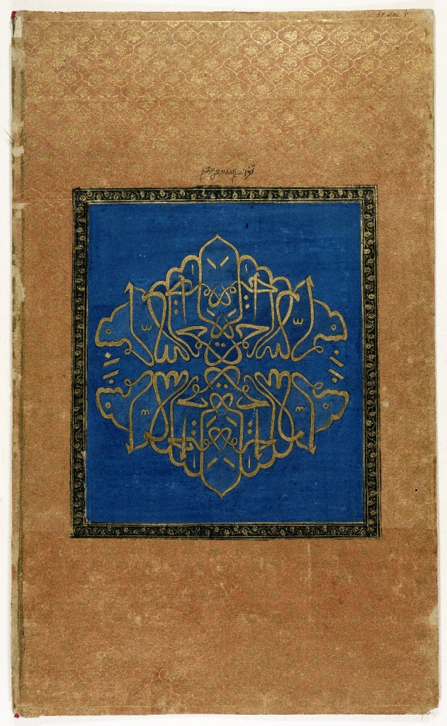
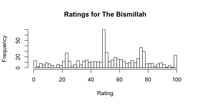
In the case of a work which was simply confusing, we would expect a uniform distribution of ratings, where any one rating was as likely to occur as any other. Instead, what we see here are distinct peaks and valleys. There are small peaks around 25 and 100, and larger peaks around 50 and 75. This indicates participants’ opinions about the work split them into at least three groups: those who did not like it (the peak at 25), those who were decidedly indifferent (the peak at 50), and those who liked it a lot (the peaks at 75 and 100). A similar situation can be seen in the rankings histogram for the second most contentious object, The Bismillah, a work which is distinguished by its calligraphic, non-representational nature:

Indian. The Bismillah, 1875-1900. Opaque watercolor and gold on paper, sheet: 19 5/8 x 11 13/16 in. (49.8 x 30.0 cm). Brooklyn Museum, Gift of Philip P. Weisberg, 59.206.8

In both of these cases, symbolic factors not accounted for by our experimental model had an extremely strong effect on the results, strongly suggesting a direction for further research. As interesting as it is to see the symbolic world bursting out of our tightly constrained experimental framework, it’s not surprising: we are, after all, looking at art.

Beau Sievers is a composer and music cognition researcher. He has a blog. Growing up in the Bay Area, he's been bossing computers around (and vice versa) since the 3rd grade. He is currently working on his PhD at the University of Virginia.


Start the conversation