Split Second: Why Indian Paintings?
I am listed as a contributor to the Split Second project, but I really wasn’t the brains behind it; I’m just the person who okayed the use of Indian paintings and then wrote the accompanying labels. Think of me as the grocer who provided the ingredients for the meal that Shelley and Beau cooked up.
I’ve been silent so far because the analysis of the results is really a matter for someone with a more statistical bent. But since the project assessed the perception of works of art there might as well be a little discussion of the art we used. I’m going to give you a little background info here and then later I’ll talk about my responses to the data we gathered.
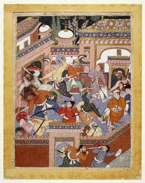
First of all, a plug: the exhibition closes December 31, so I encourage you to get to the Museum before that. The paintings are really wonderful and won’t be on view again for a while because they’re light sensitive. We’ve got some serious masterpieces on view. This one in particular is a show-stopper, made by a team of the best artists in India for an emperor who spared no expense:

Led by Songhur Balkhi and Lulu the Spy, the Ayyars Slit the Throats of Prison Guards and Free Sa'id Farrukh-Nizhad, page from a Hamza Nama manuscript. Imperial Mughal school, 1562-77. Museum Collection Fund, 24.46.
If you come to see the paintings in person I think you’ll be surprised. They’re definitely not as flat as they seem on a computer screen and they’re all different sizes—something you just don’t comprehend when you look at reproductions, even if the dimensions are listed. This painting, for instance, is the size of a subway poster (for a train not a station) while most of the others are more the size of a page in a coffee table book or even smaller. In many cases, you can see the exquisitely painted details far better in person. So hurry over!
Let me tell you a little about why we chose Indian paintings in the first place. First of all there are the nuts-and-bolts reasons: we have a lot of high-quality Indian paintings in the Brooklyn Museum collection and all of them had been photographed in color thanks to a big digital capture project we did a couple of years ago. It also seemed like a nice complement to, and subtle promo for, the big Vishnu exhibition, which was going to be on view for much of the same period as the Split Second installation (Vishnu closed in October).
Then there are the more intellectual reasons: Indian paintings are basically flat, and they are unfamiliar territory for much of our audience. Flat is good because photographic reproductions of flat objects are more straight-forward and uniform than photographs of three-dimensional objects. We were worried that variable factors like background color and dramatic lighting would influence participant reactions to photos of teapots or scarabs. There are variables in the photography of Indian painting—whether one uses raking light to pick up the glint of metallic paint, whether one includes all or some or none of the border that appears around most Indian paintings—but they’re not as significant as those for photography of 3D objects.
Unfamiliar is good because we wanted people to come to the material with fresh eyes and few preconceptions. We didn’t want them to recognize masterpieces or famous artists and rate them more highly because they felt like they should. We had people describe their level of expertise or familiarity with Indian art before doing the experiment and most were complete newcomers.
There is one way in which Indian paintings were inappropriate material for a split-second experiment: these paintings definitely weren’t designed to be glimpsed quickly. “In your face” impact isn’t a quality many of them were supposed to have. With the exception of the oversized painting illustrated here, they were all gathered or bound into manuscripts; their aristocratic owners held them in their hands or on a table. In intimate groups or solo, the viewers went slowly through the pages, looking at the paintings as a form of entertainment. Book illustrations require a different style and approach to image-making than wall-hung paintings that might be seen from across the room. The many tiny details that you can find in Indian manuscript paintings are a result of their relatively small size, but they are due even more to the practice of looking at manuscripts closely and at length: the artist wanted the viewer to have plenty to look at, to make new discoveries every time he or she opened the book. So these illustrations were rarely judged on their ability to make a split-second impression—until now!

Joan Cummins is the Lisa and Bernard Selz Curator of Asian Art at the Brooklyn Museum. Joan received her Ph.D. in 2001 from Columbia University. Prior to coming to Brooklyn, Joan served as Assistant Curator of Indian, Southeast Asian, and Himalayan Art at the Museum of Fine Arts, Boston. Her most recent book is an introduction to Indian painting, published in 2006 by the MFA, Boston. Joan was a Research Associate in Brooklyn's Department of Asian Art from 1991-1993.
