The Big Picture(s)
As Kevin mentioned in his last post, Connecting Cultures is presented in thematic sections: Places, People, and Things, in addition to an Introductory Center. Since the artwork was curated cross-collection, the question for me as a designer was how to visually unify artworks that spanned 5 millenia, and were products of so many unique artistic practices from around the world.
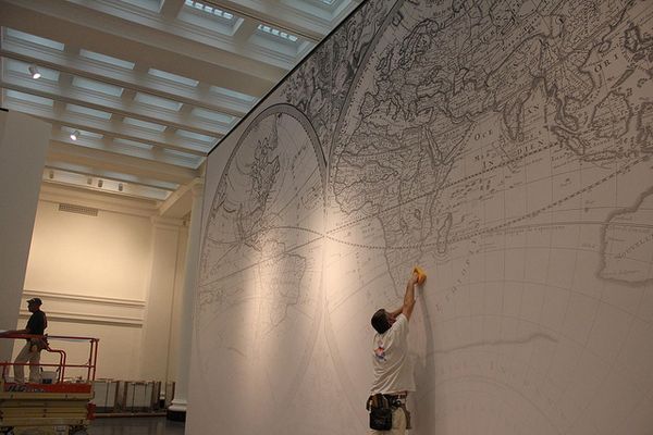
The easy solution would have been to choose one color for each section, but since the room is 24-feet high, and most of the art is under 4-feet tall, that would have left a lot of empty visual space, even after double-hanging. And so I began to explore the idea of using over-sized murals as backgrounds, and asking myself questions like, “what is something visual that connects all of these works together?” Immediate answers for the place section for example would be to use the weather or landscape. I even thought about things like seismographs or lightning, which are universal experiences. Then, I moved to think about what structures, or frameworks, could hold each group together. I began to think map, and then met with the Museum’s librarian Deirdre Lawrence who showed me our 1680 Sanson Atlas, and its beautiful world map. Taken to greyscale, and then with a white-to-transparent overlay, the Sanson map clearly indicated Place and gave the artwork installed on top of it an instant cohesion; the greyscale then allowed the artworks’ color to pop forward.

One of the first things you'll notice upon entry are the gigantic murals that we've installed on the walls as background images, each one relates to the themes we are highlighting. Here, a world map from the 1680 Sanson Atlas is getting installed in the "Place" section.
I then extended this idea of structure and greyscale to the other sections. One common framework of all people is the skeletal system, and so I worked with a skeleton drawing by Daniel Hungtinton from our American collection. Skeletons and anatomy also being one of the first subjects you draw as an art student. For Things, I met with the planning department, and paged through decades of old blueprints produced for the Museum. A drawing of one of the Museum’s staircases from 1954 by Brown, Lawford & Forbes, became the background for a display of historical and contemporary mirrors.

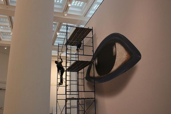
The Egyptian eye that you see upon entry is just a mere 2.5 inches in real life, but has been digitally captured and rendered in hi-definition. Enlarged to 19' wide x 22' tall, its 1000% enlargement makes the statement, "look."
And last, was the question of what to use as an “entrance” for an installation about new ways of looking at out collection. Our common structure for looking is the eye, and in our Egyptian collection we have a life-size eye made 3,500 years ago, from Obsidian, limestone and blue glass. This 2 1/4″ eye was photographed in HD by Karl Rudisill from Duggal, in 6 parts, re-assembled into an 18GB file, and then enlarged to 19′ wide at 1,000% enlargment, without pixellation. A miracle of photography.
Together, these monumental murals form a dramatic set of indicators that provides unity for all of the places, people and things that artists in our Permanent Collection, have created as records of our amazing world . . . A world in Brooklyn.

Matthew Yokobosky came to the Brooklyn Museum as an exhibition designer in 1999, and was appointed Chief Designer in 2002. He earned a B.A. in film studies and design from the University of Pittsburgh in 1986, and, one year later, moved to New York to work at the Whitney Museum of American Art. While at the Whitney, Yokobosky held many positions, including exhibition designer (1995 Biennial, The American Century (1999)) and associate curator of film and video (No Wave Cinema, 1996; Fashion & Film, 1997). During the same period, he designed theater productions (Ping Chong's 1989 show Brightness, which won a Bessie award for set and costume design) and books (Yoko Ono: Arias and Objects, 1991). For the Brooklyn Museum, he has designed the critically acclaimed Luce Center for American Art (2002/2005, permanent installations), as well as over 30 temporary exhibitions including Hiroshige: 100 Famous Views of Edo (2000), Basquiat (2005), Annie Leibovitz (2006-7), and I Wanna Be Loved by You: Photographs of Marilyn Monroe (2004), which he also curated.
