Advances in Exhibition Casework
In my last post, I discussed the wall murals and the state-of-the-art photo enlargements in Connecting Cultures. Today, I’d like to talk about a few other firsts that make this a cutting edge Museum display.
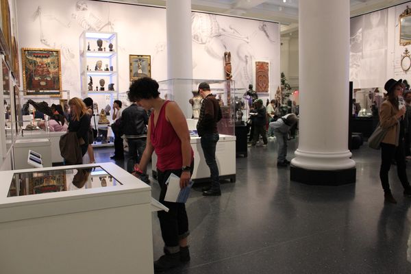
Connecting Cultures is the first museum installation to utilize Optium for every vitrine and glazed surface. Optium is an anti-reflective, anti-static, abrasion-resistant and clear-coated acrylic produced by Tru Vue. Unlike regular Plexiglas glazings which mirror and reflect adjacent surfaces, these Optimum cases appear completely transparent. Optium has various coatings and is not easy to fabricate into 5-sided vitrines, but Allen Blum at Grewe Plastics had developed a fabrication method. The second challenge was that Optium is produced in very small quantities and when Allen contacted Tru Vue about our project, the President of Tru Vue personally called Allen to assure him that they would guarantee enough material to complete all 32 vitrines and glazing for the Pitcher Wall.

A visitor activates a Smartglass case to view the light-sensitive object inside. Optimum is used on other casework (like the Buddha tower in the upper left), so the vitrines are anti-reflective.
Working with Van Wood at the Small Corporation (SmallCorp), we were able to develop a new type of exhibition case for light sensitive materials using Smartglass as an electronic curtain for art. Smartglass is often used in architecture for privacy; it looks white or grey, but when activated it diffuses light or becomes transparent. Many people have also seen it used for unique applications, such as the dressing room doors at Prada in Soho. Smartglass is composed of two sheets of iron-free glass, with a 1/64″ film between that contains microscopic particles. When opaque, these particles are scattered; when electrified, the particles align vertically to allow light to pass through. At the Museum, our Conservation lab tested the Smartglass and found that when opaque it only allowed less than 1% of light diffusion, and less than 1% UV. For light sensitive works on paper and textile, these Smartglass curtains will extend the exhibition period of fragile works and do away with the need for fabric coverings and light locks.

Smartglass curtains will extend the exhibition period of fragile works. Visitors push a button to reveal the object sitting inside the case.
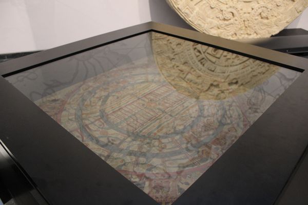
Label troughs are not an area that would seem to be terribly innovative, but if you think about it, most labels are either on walls or on the sides of cases. There is also the variation of having a label installed on an angled deck inside the case. Though it has its advantages, I always felt that having angles above the collar line read too much with the artwork and changed the shape of the casework. My solution was to sink the label rail into a trough below the deck and collar line. This retains the casework’s squareness, doesn’t compete with the shape of the artwork, and perhaps surprisingly is very easy to read especially through reflection-free Optium.
Together these three advances in casework design give Connecting Cultures a state-of-the-art look and feel.

Matthew Yokobosky came to the Brooklyn Museum as an exhibition designer in 1999, and was appointed Chief Designer in 2002. He earned a B.A. in film studies and design from the University of Pittsburgh in 1986, and, one year later, moved to New York to work at the Whitney Museum of American Art. While at the Whitney, Yokobosky held many positions, including exhibition designer (1995 Biennial, The American Century (1999)) and associate curator of film and video (No Wave Cinema, 1996; Fashion & Film, 1997). During the same period, he designed theater productions (Ping Chong's 1989 show Brightness, which won a Bessie award for set and costume design) and books (Yoko Ono: Arias and Objects, 1991). For the Brooklyn Museum, he has designed the critically acclaimed Luce Center for American Art (2002/2005, permanent installations), as well as over 30 temporary exhibitions including Hiroshige: 100 Famous Views of Edo (2000), Basquiat (2005), Annie Leibovitz (2006-7), and I Wanna Be Loved by You: Photographs of Marilyn Monroe (2004), which he also curated.
