The Design Spin Cycle
When I started as Web Designer for the museum in January, I assumed I had been hired for a website redesign. Rookie mistake. As you’ve been reading, Shelley, Sara, and others had been hard at work brainstorming, testing, and researching this much larger project for Bloomberg Connects, an initiative which extends well beyond your ordinary website redesign. There are a lot of moving parts—an app, digital signage, applications that our engagement team will use to answer questions—the iOS app is just the beginning. I’m jumping in where Jennie left off to talk more about the mobile design.
There is a lot of talk today about splitting functionality into separate apps. Foursquare is now both Foursquare and Swarm. Facebook has Camera and Messenger in addition to their main app. Should we be doing the same?
Our mobile experience has two clearly distinct goals—an informational experience (what’s happening, when we are open, and how to find us) and the more experiential ASK functionality. Each of these parts could easily exist independently of each other. Do our visitors have expectations of them being bundled? Or would the experience be more pure if they were kept separated? ¯\_(ツ)_/¯
What we’ve decided to do for v1.0 is to keep these halves married. We believe it would add more friction to require our users to download two separate apps than to use a single app with two separate goals. Our user research, though, will shine light on this and help point the way forward.

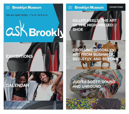
Keeping the two halves married means re-skinning our current mobile (informational) website and adding (experiential) ASK functionality.
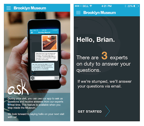
As Jennie said, we based our ASK conversational tool on iMessage. We did this because it works. Our prototyping testing went so smoothly we knew any design which deviated too much would create unnecessary friction for our users. The mental model of iMessage just works. While we kept the mental model intact, we did remove some functionality. For instance, the in-app camera is cropped square, without option. We want the users to use it as a communication tool without concern for framing or lighting or other arty stuff. To a similar end, we aren’t allowing uploads from the camera roll because we only want to know what someone is looking at in the museum *right now.*

Selecting ASK from the mobile home screen gives the user two views depending on where they are standing. Outside the museum, they see a call-to-action to come in and use ASK, which will be activated based on their geolocation. Once inside the museum, the feature is active and ready to use.
With the conversation part of ASK working, we are now moving on to layering in the informational content like exhibition or event info which you would normally expect to see from a museum’s mobile website. To keep things simple, what we’re currently designing for the informational half of the app is more or less a re-skinning of our current mobile site, but this is a stop-gap solution until the later phases of the project when we’ll be rethinking our website from the ground up, responsively.
The challenge is that we haven’t yet designed that new website. Like I said, that comes much later. This is the iterative process in action. With so many things being designed and built all at once, we are forced to make decisions and to prioritize. Everything is getting their feature-sets piece by piece. We’re lifting the curtain on this process for you here, but our hope is that our users will never be aware of all these seams. There’s certainly a “wow” factor when you can do a Big Reveal, as if it were possible for us to release the completed app and the new website all at once, but we aren’t doing that.
We are far more excited about building these tools and getting them into the hands of our visitors as quickly as possible, testing what works and what doesn’t, and creating the best experience possible. This also means not being precious about the design. If our user research suggests a feature or layout must change, then we’ll change. it. Our metrics for success are determined by how much enjoyment and practical use our visitors get out of the ASK app. We’re not looking for conversions or return on investment. We’re building a tool around the needs of our users and we’ll continue to watch and listen closely so as to be sure we’re building the right thing. All research so far shows that we’re on the right path.

Brian is a web designer and developer and has worked for the Brooklyn Museum since January 2014. He blogs words and photos at brianfeeney.us.


Start the conversation