Twitter?

What’s wrong with this picture? As it turns out, a lot. At the October 6th Target First Saturday, we decided to experiment with Twitter and this post will take you through the first wave of our experience. As with all new web ventures, we like to keep things as simple as possible until we get a feel for the requirements. When starting with Twitter, we decided to simply give updates at the event and not complicate the issue with the Twitter API, so I updated our feed manually throughout the evening.
Problem #1 came during testing. Although it’s a fairly simple process to sign people up on the spot, it requires 5 text messages to do so. To join our feed from the event:
- Visitor texts “follow username” to 40404
- They get a message back “Now you’ll know what’s going on with username. But, what are you doing? Reply w your answer.”
- They respond with something.
- Then they get another message “Thanks! Reply w your name so you can tell friends how to follow you!”
- They respond with their name, so the account can be identified.
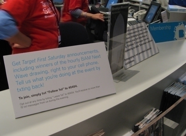
Umm, wow. That’s a lot to get someone signed up and a bit confusing if folks don’t know the social aspects of Twitter, right? When you’ve got thousands of people coming through the door it’s impossible to explain all this. We made an attempt in our signage (above), but it makes the sign text heavy and that’s not good.
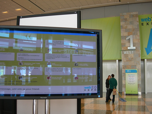
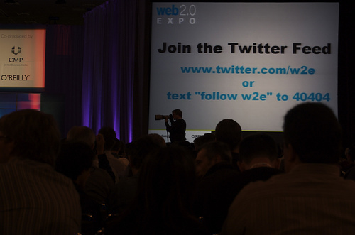
Problem #2 cropped up with our signage. Take a look at the photo above. We had about 10 of these tabletop signs on the visitor desk and other locations, but they were small and text heavy. With thousands of people streaming through the doors, this type of signage gets buried. As I was watching all of this during the event, I remembered something. Back in the Spring, I attended the Web 2.0 Expo in San Francisco and look what they did:


(photos L to R: emilychang, MichaelBee)
There were giant displays with all the Twitter activity right as you went into the conference halls. In the auditorium, they had slides encouraging people to sign up. I wish I could put these displays right where our lines form for tickets, but there’s no budget for this…..at least not in the early stages. What really got me at the Expo, was the spectacle of it all. When you see a display like this, you instantly get the social nature of the application and you don’t get buried in too many words. It’s a very visual thing and it works very well.
Problem #3 concerned use. At a conference like Web 2.0 Expo, Twitter makes a lot of sense. Many participants come alone and need to make connections with each other. At Target First Saturday, most people come in groups and are socializing already, so I’m not sure it works as well in this context. In addition, Twitter is great for people with unlimited sms plans, but for people who have limited plans or pay-as-you-go txting, it’s a lot of messages: 5 to get started + announcements from us + txting what you are doing = do I really want to do this?
Is the use of Twitter at live events over at the Brooklyn Museum? Well, I’m not totally sure. This application may not be right for us or it may just require more experimenting to find the right use. Many of us have read this blog post, and we’ve been thinking along these lines. It might work really well if:
- The sign up process could be simplified. It would be really great if Twitter had an “event mode” to bypass some if the back and forth.
- Signage is adjusted.
- We did something really special with Twitter, so that visitors are engaged and want to participate.
- Perhaps we stage a Twitter event, so that people already using Twitter are the participants instead of trying to recruit a new audience.
We learned a lot here and all of it is valuable as we move forward. Many thanks to Biz and Alex at Twitter for helping with support issues and questions. I have to say, it’s really fantastic to be able to talk to a founder and a developer directly and was a tremendous help in this first go round.

Shelley Bernstein is the former Vice Director of Digital Engagement & Technology at the Brooklyn Museum where she spearheaded digital projects with public participation at their center. In the most recent example—ASK Brooklyn Museum—visitors ask questions using their mobile devices and experts answer in real time. She organized three award-winning projects—Click! A Crowd-Curated Exhibition, Split Second: Indian Paintings, GO: a community-curated open studio project—which enabled the public to participate in the exhibition process.
Shelley was named one of the 40 Under 40 in Crain's New York Business and her work on the Museum's digital strategy has been featured in the New York Times.
In 2016, Shelley joined the staff at the Barnes Foundation as the Deputy Director of Digital Initiatives and Chief Experience Officer.
