Click! The Book

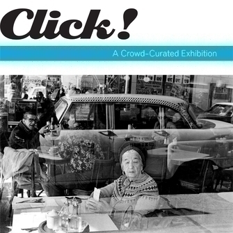
Cover: Marcia Bricker Halperin. Dubrow’s Cafeteria, 1979.
Softcover: 86 pages, 7 x 7 inches.
Details, including a special $3-off coupon from Blurb.com, can be found here.
It may seem strange that in the third millennium, we still communicate by pressing pigment against the pulp of crushed trees. And yet, although we live in an age of digital data flickering on a screen, people remain deeply attached to books—to the way books look, the way they feel, even the way they smell. A book is, after all, a physical object, with an outside and an inside, and it invites you to enter its inner world and explore it, page by page. This remains an exciting adventure, not only for those of us in the publishing business but for the many millions of the dedicated book-reading public as well.
But how do you produce a publication appropriate to the special nature of Click!, an electronically generated project in which the curatorial shaping of content was designed to take place outside the walls of the Museum and be conducted by the public, in cyberspace? Instead of following the traditional publishing route and working with an established trade publishing company, it was decided to shape the catalogue, like the contents of the show, via the Web—using open book-making software and site resources that are readily available to ordinary users, not only Museum professionals. It’s the kind of project plan often described as “self-publishing.” Although it wasn’t possible to have the public at large create the bound book to the same extent that they had curated the show, it was possible at least to acknowledge the show’s distinctive method by producing this book the way any person with access to the Web would make their own, self-published book—by using easily accessible online resources. Stepping outside the Museum’s conventional way of doing books, which are usually formal ventures with mainstream publishers, the idea was to make this particular book in basically the same way anyone with a computer would go about it.
This meant that the Museum would be making its first foray into the growing business of print-on-demand publishing. Instead of producing thousands of copies of a given book and then storing them in a warehouse or a bookstore backroom until stock is needed, in this new form of publishing, a book is printed when, and only when, someone actually orders a copy, which is then individually output, bound, and shipped. To put the book project into the works, its creator, Shelley Bernstein, worked with Blurb, one of the best-known firms in the self-publishing field, and uploaded the Click! pictures, captions, and text into Blurb’s graphic-design software (while consulting with the Museum’s own editors and designers to choose type fonts and graphic treatments consistent with the institution’s standards). As a result of her innovative thinking, anyone can order a copy of the exhibition’s accompanying book, available directly from Blurb. Now you can experience Click! not only as an array of online images, or as a set of printed photos affixed to the walls of a Museum gallery, but also as a material object you can hold in your hands and keep.
There are those who feel that creating books through “assembly” software online represents, potentially, a revolution in bookmaking almost as significant, in its way, as Johannes Gutenberg’s invention of movable type around 1439. Part of Gutenberg’s genius lay in chopping up words and sentences into their individual letters as separate pieces of wooden or metal type, so that those atoms could be easily assembled into new, unique pages of text ready for printing. Breaking information down into those tiny “bits” actually made it easier to put the necessary pieces together to create something new. In our era, with the resources of the Web, the components of a book can be assembled for printing as freely as Gutenberg assembled the letterforms of words for his press, but now working in the unfettered realm of electronic impulses rather than solid type. You can imagine Gutenberg looking down from his cloud in the great beyond, surveying the world of digitally created books, and saying, “Aha! Not just movable type, but incorporeal type!”

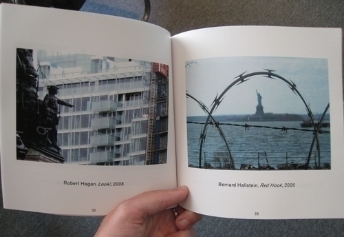
The Click! book serves the same purposes as the online and gallery exhibition, but in its own way. For instance, since the book is, essentially, a photo album in which each picture has its own page, this volume restores the pictures to the egalitarian same-size-for-everyone format in which they were submitted during the open call, instead of following the vote-based larger-versus-smaller sizes assigned to them in the gallery. And it puts the images back into a truly impartial order: alphabetical, by artist name, which is about as nonhierarchical and seemingly “random” a sequence as you can get. Although neutral in itself, the book’s nonjudgmental sequence does make for some surprises: Since by their very nature books are made up of two-page spreads, in our book every image has a random alphabetical companion on the facing page, which produces some astonishing accidental juxtapositions that would have warmed the heart of John Cage. Supposedly unrelated images on two facing pages speak to each other in ways that no one could have predicted. Sometimes the impromptu encounter between two unlikely companions really clicks.

James Leggio is Head of Publications and Editorial Services at the Brooklyn Museum. He came to the Museum after serving as Senior Editor at Harry N. Abrams, Inc., and as Editor at The Museum of Modern Art, New York. Jim manages the Museum’s publishing program, supervising the editorial preparation of all the Museum’s books and negotiating their contracts with publishing houses. He is a scholar in his own right, with published articles on Robert Rauschenberg, Alfred Barr, Vasily Kandinsky, and Arnold Schoenberg. He has also written a brief guidebook to the architecture of the Brooklyn Museum published to coincide with the completion of the Rubin Pavilion, designed by Polshek Partnership Architects. Jim holds a Ph.D. in English literature from the University of Virginia. He lives in Brooklyn with his wife, their cat, and their books.
