Kiosks in Museums: Win, Lose or Draw?
A couple of weeks ago, I discussed the issue of technology in museums and asked if tech engages or distracts. The post mainly served to open the question and the responses we received from visitors and museum colleagues were quite varied. I wanted to open the floor to another question…this time looking at a more specific example of computer kiosks in art museums. I’m going to dive in with our own examples at Brooklyn to talk about some of my frustrations, ask some questions and think about when these really work and when they don’t.

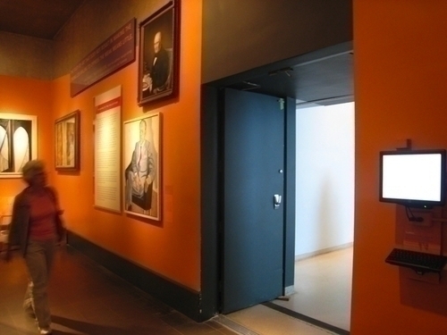
I’ll start off with what we consider a win example—our comment kiosks. Throughout the museum, we replaced the paper comment books with electronic kiosks. The interface is not that fun or user-friendly, but it’s simple and many visitors use them to give us their feedback. These have been fairly positive for us. They allow us to see visitor feedback in real-time, they are easier to maintain since we don’t have to replace pens/books, and the comments are available via the web, so anyone can view the visitor response. We actively monitor the incoming feedback and, in some cases, have made adjustments based on the comments to improve the visitor experience. We are working through some issues now to make the kiosks more visitor friendly—softer and less noisy keyboards, height adjustments, easier controls to page through on the touch screens—for the most part they work pretty well and we’ve been told by our visitors that they appreciate the opportunity to be heard.

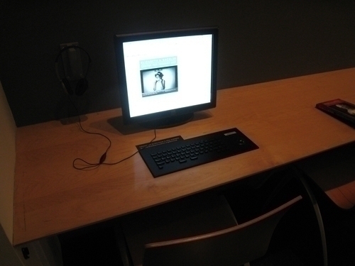
Next up, let’s look at what might be considered lose example and, wow, does this make me cringe. I’m sure many of our readers have seen the put-the-whole-website-on-the-kiosk-in-some-central-location example in some museum somewhere? We are guilty of the “whole-website” kiosk—in our Elizabeth A. Sackler Center for Feminist Art we have two computers in a study area that essentially display the EASCFA website. I rarely see people using them and when I do, they are not sitting for long and I have to wonder if visitors are getting anything out of it at all. I’ve been discussing all this with the Center’s curator, Catherine Morris, and we’d both like to hear your thoughts on the issue as we discuss possible changes. While we don’t have a lot of time or budget for an overhaul, we are tossing around the idea of displaying the Feminist Art Base, instead of the entire EASCFA site with the thought that perhaps more directed content might compliment the exhibitions and the artists in the Center a bit better. I’ll throw these questions out there: Why would you take space in a museum to show off your web site? Has anyone seen this work well? Is this kind of thing helpful at all?
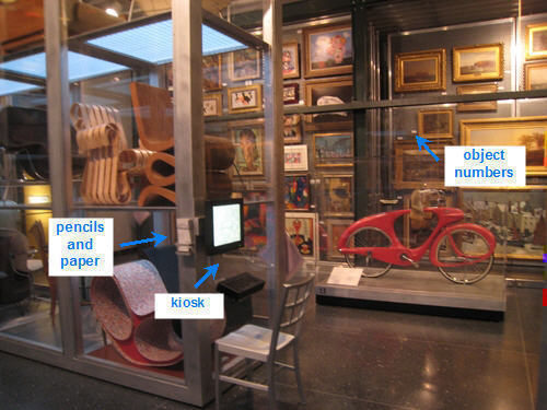
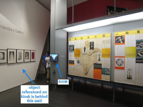
We’ve definitely got a couple of examples of draw hanging around. In both the Luce Visible Storage area and The Dinner Party installation, there are kiosks that display more information about the works on view. In both installations, we can’t display information about the works alongside the objects, so we use computer kiosks to provide the additional information on demand. The content on these kiosks is actually quite useful (I’d actually go so far to say essential), but both have issues that can make the experience of using them a frustrating one. Let’s take a look at the Luce Visible Storage kiosks first:

Visible Storage is just that, a working storage room that is open to the public with as many as 2000 objects on display. Objects are identified with their accession number… that’s a pretty long number starting with the two or four year date of acquisition…47.203.16 is a pretty typical example of an accession number. Although, there are six kiosks evenly spaced throughout the center, it’s pretty difficult to remember the numbers of the things you’d like to look up. We do provide pencils and paper to make this a bit easier, so those provisions help a bit. When you get to the stations, you’ve probably forgotten the number if you didn’t write it down. Interestingly, we all knew this was going to be an issue and in the original spec for the Visible Storage we were going to loan visitors the Dell Axim so they could do look up objects on the go, but we couldn’t figure out how to check them out without frustration. With no budget to hire a staffer to loan them out when visitors arrived at the fifth floor installation, the thought of people having to turn around and go back to the front desk to get one seemed problematic. If a visitor happened to get one in the lobby, they’d have to tote it through their entire visit only to use it in that one area. Just re-visiting this history to write this post makes me bonkers and we tabled it knowing that kiosks in the general proximity with pencil/paper was going to be the clearest solution at the time.

In The Dinner Party, the kiosks are outside the physical installation space. This may seem odd, but these have been installed in the area where Judy Chicago’s Heritage Panels reside for a very specific reason. The progression follows the artist’s intent and is designed so the visitor has a singular experience with the table/floor, then moves out into the research area where the Heritage Panels (and kiosks) are available for reference. Luckily, the kiosks are just one level of interpretation—we’ve also got a cell phone tour and small booklets that can be used in the installation area unobtrusively. On a recent visit, I remember walking through The Dinner Party with my mother as she started to rattle off details about all the women at the table—that’s what you get for having a history teacher for a mom—she could talk background on all but two of the 39 women featured. We had forgotten to pick up the booklet, didn’t have our phones and by the time we exited the installation and walked over to the kiosk, neither one of us could remember which of the 39 she didn’t know about and we didn’t want to stick around at the computer to try and figure it out. The kiosk had really valuable information, but it was too far out of reach the moment we need it.
In terms of these two draw examples, we’ve got a mobile solution coming next week that should help alleviate these issues for some visitors and place these examples into more of a win category. In the meantime, I’d love to know your thoughts about kiosks in art museums. This link sent to me via Nina Simon was some entertaining, head bobbing in agreement, not to be missed reading. Let’s hear it…seen anything really awesome or really annoying that you’d like to share?

Shelley Bernstein is the former Vice Director of Digital Engagement & Technology at the Brooklyn Museum where she spearheaded digital projects with public participation at their center. In the most recent example—ASK Brooklyn Museum—visitors ask questions using their mobile devices and experts answer in real time. She organized three award-winning projects—Click! A Crowd-Curated Exhibition, Split Second: Indian Paintings, GO: a community-curated open studio project—which enabled the public to participate in the exhibition process.
Shelley was named one of the 40 Under 40 in Crain's New York Business and her work on the Museum's digital strategy has been featured in the New York Times.
In 2016, Shelley joined the staff at the Barnes Foundation as the Deputy Director of Digital Initiatives and Chief Experience Officer.
