Membership is your friend…with benefits!
Over the last year Will and I have been taking a closer look at the benefits we offer our Members so that each one is not only meaningful, but also relevant to the way in which Members interact with the Museum. Instead of cutting back in these tough times, we came up with a whole new set of benefits for Members for the 2010 fiscal year (July 2009-June 2010) tailored to these interests.
As we began to add these benefits, it became apparent that our signature publication—the Membership brochure—was in need of a major update. Rather than simply adding the new benefits to the existing brochure, we took this opportunity to completely redesign this publication. After all, the Membership brochure is our primary means of communicating what a Membership offers, and why it’s important, to anyone who walks into the Museum.
As we tackled the new design of the brochure, we had three things in mind: it should be aesthetically appealing, as comprehensive as possible, and convenient for anyone deciding to join. So I sat down with Caroline, the Museum’s extremely talented (and patient) Senior Print Designer, and we brainstormed how to best accomplish these objectives. Here are the major changes that we came up with:
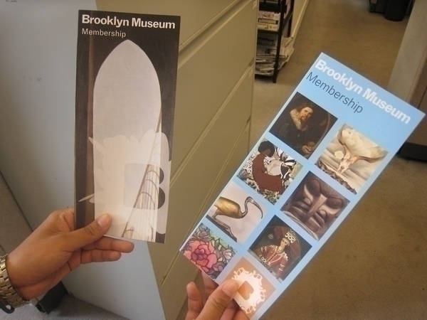
First, we decided to revamp the brochure’s cover. We said goodbye to Georgia O’Keefe’s Brooklyn Bridge, which was on the cover of the old brochure, and said hello to an eye-catching compilation of images from the Brooklyn Museum’s permanent collections. You may have noticed this design in various other Membership materials, like our Web page or the monthly Membership e-newsletter, so it only seemed fitting that this should also be the face of our Membership brochure.

New look on the right, with the older version on the left.
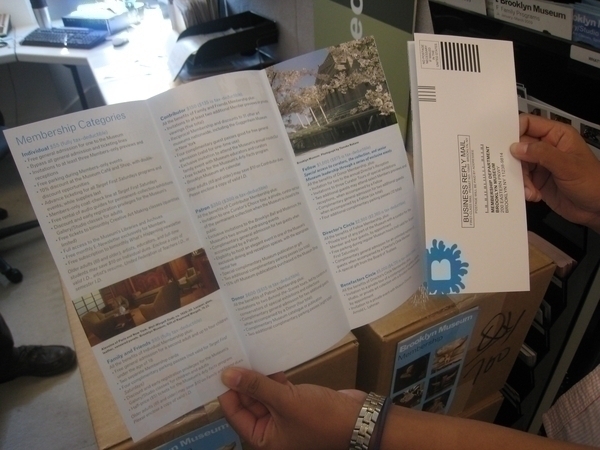
From there, our most important concern was that the benefit information clearly unfold (pun intended) on the inside. We added more pages so the entire list of benefits would fit, made the text easier to read by incorporating a lighter color background, and we even decided to print the brochure on heavier paper stock so it would carry more weight (pun intended…again).
Finally, we took inspiration from the Studio Museum of Harlem‘s membership brochure by including a perforated membership application that can be sealed and mailed back to us in a self-envelope. We went one step further, however, by making the envelope prepaid so Members can return it to the Museum at their convenience.

Pre-paid, detachable envelope!
After many months of collaborating on this project, I’m positive that I not only owe Caroline the largest chocolate bar on the planet, but also that we successfully achieved our goals: we added value to our Memberships with an increased number of meaningful benefits, and we’re presenting them in a better package. So next time you stop by the Visitor Center, grab a brochure and take look inside!

Nitasha Kawatra worked in Membership at the Brooklyn Museum from April 2008 to November 2010. Known as Tash amongst friends, she was born and raised in Memphis, TN and received her BA in Art History and French from Bowdoin College in Maine. She completed part of her studies in Paris, France and also interned at the La Napoule Art Foundation outside of Cannes. Prior to the Brooklyn Museum, Tash coordinated educational travel programs for members of non-profit institutions. Tash now works in Membership at the Metropolitan Museum of Art.
