Stressing and Scrolling in a Blink
One of the things we wanted to do with Split Second is talk about the tool that we developed for the online activity. Much like the evaluation tool we developed for Click! A Crowd Curated Exhibition, a lot of thought went into how to design something that would work to capture a result among many participants using certain theories as a framework. What I love about working on a project like this is how much response we get from participants about the tools they use, so let’s take a look. You’ll get some anecdotes from me, but I’d also love to hear your own responses in the comments.

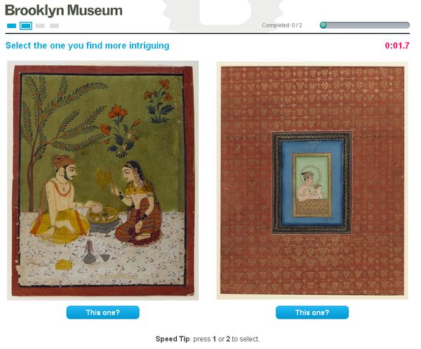
The first section of Split Second is designed as a speed trial with two works shown side by side; the participant is given four seconds to select the one that they find most intriguing.
The thing that I keep hearing over and over again is how much everyone is stressing out about the timed choice between two works in part one. We’ve had a range of responses, but many indicate that looking at art this way feels wrong. I see that point, but it had me thinking about what happens when I walk through a museum. Upon entry into any room, I have dozens of opportunities to look at works and limited time, so I make quick choices and often without even realizing it. What are the works that I’d cross a room for? What object am I drawn to enough to spend time with? What catches my eye? The tool is artificially presenting this situation to the viewer without the benefit of other devices (gallery design, wall labels, installation choices). Interestingly, I was discussing this with a friend of mine and the thought had her wondering if this was why she often didn’t like going to art museums and found them stressful. Several other friends I’ve spoken with indicated that they noticed that the tool had them recognizing how much they were drawn to certain types of works when faced with quick decisions. I’d love to hear about your own experience in the comments.
The second most talked about issue is scrolling; participants using smaller screens or laptops are having to scroll to fully see certain images. The scrolling combined with the quick decision requirement is driving some people slightly nuts. So, how are people dealing with this?

We are capturing stats to see how participants are dealing with the need to scroll.
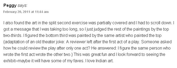
According to our stats, roughly 51% of participants can see both images clearly. The other 49% are handling this in two ways—either by scrolling and casting ratings within the time limit (30%) or casting ratings while the images are partially obscured (19%). The average timeout per session is 1.25, so most participants have figured out how to deal with this situation one way or another. By far, this has been my favorite comment about the situation:

Comment via Peggy on my last Split Second blog post. We love hearing from folks taking time to do this!
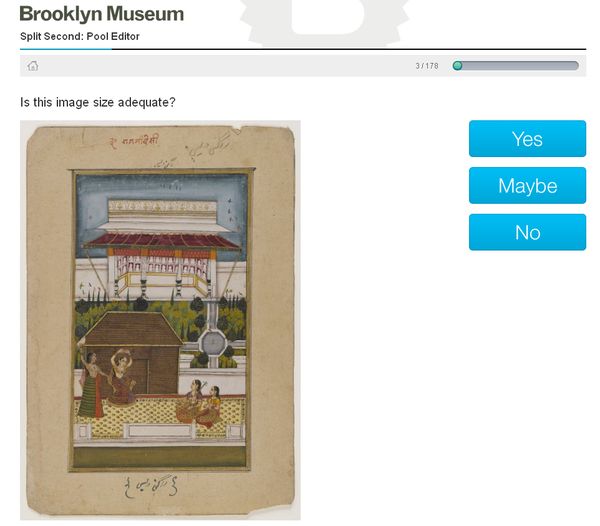
So, why not design so everything can be seen without the need to scroll? Well, the short answer is we tried, but the objects have to be seen and many of these paintings have a lot of detail, so we were conscious that they can’t be displayed too small. In order to determine image size, we created an internal tool and asked staff members to run through our collection of Indian paintings given the size we were considering using in the final design.

Is this image size adequate? Internal testing tool used to see if image sizes were displayed large enough to see detail.
Some paintings were eliminated right off—staff using the tool thought certain paintings couldn’t be seen well enough given the size and, as a result, those were not included in the final pool of Split Second works. Given the four second timeout we couldn’t provide a zoom function, so we had to split the difference and go with image sizes that could mostly be seen knowing that some users were going to have to scroll. This is not ideal, but we’ll be able to separate the data to see how this may be changing things.
I’ll discuss what’s happening in sections two and three in my next post, but in the meantime I’d love to hear from you about your own experiences. Did we stress you out? Did scrolling cause you to fumble? What did you notice when making split-second decisions in part one?
If you haven’t already, take Split Second for a spin—you’ve got until April 14.

Shelley Bernstein is the former Vice Director of Digital Engagement & Technology at the Brooklyn Museum where she spearheaded digital projects with public participation at their center. In the most recent example—ASK Brooklyn Museum—visitors ask questions using their mobile devices and experts answer in real time. She organized three award-winning projects—Click! A Crowd-Curated Exhibition, Split Second: Indian Paintings, GO: a community-curated open studio project—which enabled the public to participate in the exhibition process.
Shelley was named one of the 40 Under 40 in Crain's New York Business and her work on the Museum's digital strategy has been featured in the New York Times.
In 2016, Shelley joined the staff at the Barnes Foundation as the Deputy Director of Digital Initiatives and Chief Experience Officer.
