Next up, what you see is what you get.
This post continues the discussion about the tool we developed for Split Second. Once you get past stressing and (possibly) scrolling in the timed trial, the tool asks you to slow down and consider a work in various ways prior to rating it. What you may not know is different people are randomly assigned into groups and asked different things during these stages, so your own experience is often different from other participants.
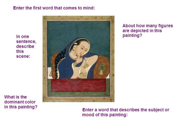
Section two of the tool is designed to get you thinking in various capacities about a work prior to rating it. Participants are split into six groups and each group is given a question or activity about ten works. Either you are asked one of five questions (shown below) or you are just given the rating scale alone.

Which activity did you get? Participants are split into groups and each group is assigned a task to complete prior to rating. (Image: Intoxicated Woman at a Window Northern India, 79.285)
In terms of the data coming back to us, we’ll be looking at a lot of different aspects. Do any of the activities have an effect on the eventual rating? How widely do answers vary to these questions? Do participants bail from the tool and, if so, which question/activity triggers this? How long do participants spend with works prior to answering and rating?
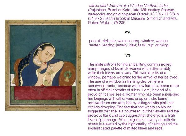
The third section of the tool is a bit of an information showdown. Unlike the first section where we are looking for gut reactions or the second which gauges whether thinking/participation has an impact on rating, this final section looks at how given information may change things. This time, we are specifically looking at the information that the institution produces to see how effective it is (or isn’t).
Participants are randomly split into one of three groups and presented with ten objects. Some people only see the object’s caption, others are given tags to consider and the final group gets what we think of as the museum “gold,” the interpretive label. I’ve spoken to more than a few participants who were really disappointed when they were randomly selected to just review tags or captions; don’t you just love it? Folks disappointed that they can’t dig into label copy is a bit of trip.

Participants are split into groups with some reviewing typical caption information, tags or label copy. (Image: Intoxicated Woman at a Window Northern India, 79.285)
In this activity we are measuring a few things. Most obvious, which type of information changes ratings. Less obvious, we’re going to be looking at length of label copy and tone of the label to see if ratings are effected simply by how we compose these materials. Also thinking about how long people linger with these materials prior to rating. We’ve got a chance to look at tagging in a new light, too. We know tagging has a positive effect on our collection’s searchablity, but do tags as information sitting on a page help or hurt a participant’s rating of an object?
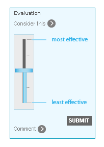
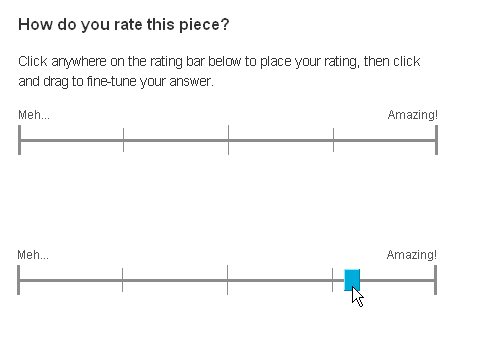
The rating scale used in both of these sections is also worth noting because it’s a notch above what we used for Click!. In both Click! and Split Second, we recognize participants are rating art and, with its many complexities, wanted to stay away from simple 1-10 or 5 star scales. In both cases, we implemented a slider with some general direction, but otherwise want to give folks as much granularity as possible. Split Second‘s slider differs from Click! in that there’s no fixed position of the slider mark itself. With Click!, the slider was fixed in the center and then moved by the participant.

Slider used in the rating tool for Click! was fixed at the center position until moved by the participant.
In Split Second, the slider isn’t fixed until a participant hovers to encourage participants to move from center and use the breadth of the scale.

With Split Second's rating tool, slider is unfixed until hover and participants are encouraged to use the breadth of the scale.
This is a subtle change that will likely have a big impact and many thanks goes to Beau for this idea and implementation. For as simple as the tool is, there’s a lot of complexity behind the scenes and Beau and Paul have done incredible work as the team behind it.
The preliminary data is incredibly rich and the questions and ideas that I’ve talked about here barely scratch the surface of what we are seeing, so stay tuned for more. If you’ve not taken part in Split Second yet, you’ve got until April 14—go for it!

Shelley Bernstein is the former Vice Director of Digital Engagement & Technology at the Brooklyn Museum where she spearheaded digital projects with public participation at their center. In the most recent example—ASK Brooklyn Museum—visitors ask questions using their mobile devices and experts answer in real time. She organized three award-winning projects—Click! A Crowd-Curated Exhibition, Split Second: Indian Paintings, GO: a community-curated open studio project—which enabled the public to participate in the exhibition process.
Shelley was named one of the 40 Under 40 in Crain's New York Business and her work on the Museum's digital strategy has been featured in the New York Times.
In 2016, Shelley joined the staff at the Barnes Foundation as the Deputy Director of Digital Initiatives and Chief Experience Officer.
