Split Second: A Curator’s Reaction to the Results
I’ve had a lot of time to mull over the results of the Split Second, so here are a few of my thoughts—roughly one week before the Split Second exhibition closes. Please bear in mind that I don’t bring any expertise on Sociology or Psychology or Statistics to the picture. What I do bring is many years of experience working with Indian art and with people who are looking at Indian art for the first time.
The original intent of the Split Second experiment was to measure people’s reactions to works of art as they encountered 1) objects that varied in degrees of complexity and 2) viewing situations that varied by time of exposure or degree of engagement. In theory the experiment could have used almost any type of art, and participants would have behaved in the same ways whether they were looking at Japanese prints, or Goya etchings, or Plains Indian ledger drawings. After looking at the outcome I have to say that I’m not totally sure that we would have gotten the same patterns of response for different genres or traditions of art. I think the fact that we used Indian paintings affected the outcome and here’s why:
First let me say that I wasn’t one bit surprised that people liked the objects better after they were given some information about them. My first experience of Indian art could best be described as “love at first sight” but I know that was unusual. The vast majority of people can’t get comfortable with an image of a guy with an elephant head and extra arms —no matter how gorgeous—until they know why he has that head and what those extra arms mean. When we ask visitors what they liked or disliked about installations of Indian art they almost always assess the quality and quantity of the information we offered first and then talk about the beauty or selection of the art as a very secondary concern. I am pretty sure that this is not the case when the same people are asked their opinion of displays of Western art, particularly paintings.
I have to wonder whether there would have been a marked difference in reaction to the same object in informed versus uninformed viewing experiences if we had used American still life paintings or French landscapes. I think that the unfamiliarity of Indian painting—which I cited as a good quality for the project in my last blog—led to more dramatic results in the informed/uninformed section of the experiment.
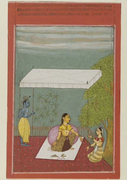
The other place where I think our use of Indian paintings affected the data was in the complexity issue. I was initially really surprised that complex images rated as highly as they did in the split second viewing. Advertisers know that you can grab people’s attention in an instant using big, bold graphics and a simple message. I would have thought that the more brightly colored images with less going on would have rated higher because people could take them in quickly. But the opposite was true. Straight-forward, easily legible images like this one didn’t do very well at all (in fact it was among the least popular)…

Nayika Awaits Her Lover (Rajasthan, Bikaner), 1692. Anonymous Gift, 81.192.3.
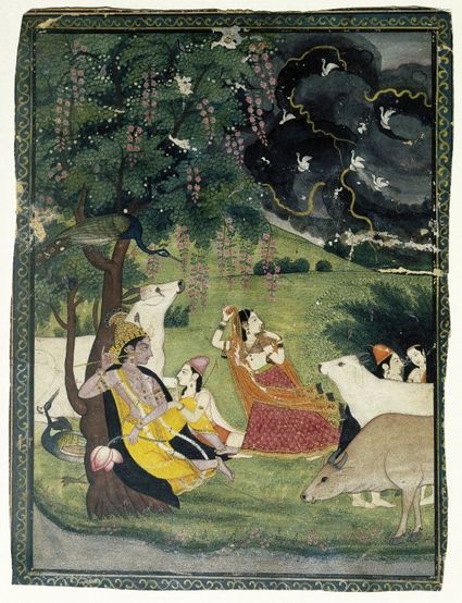
…while very complex images with more than one focal point fared very well despite the fact that there was no way people could take in all the info in 4 seconds. Here’s an example of one that did really well:

Krishna and Radha Under a Tree in a Storm (Punjab Hills, Kangra), c.1800. Ella C. Woodward Memorial Fund, 70.145.1. (Punjab Hills, Kangra), c.1800. Ella C. Woodward Memorial Fund, 70.145.1.
I think the preference for complexity comes from the fact that participants knew they were rating art, and people have different criteria for judging art than they do for other means of communication. Even in an age when conceptual art and minimalism are part of the canon, I think a lot of people retain an old-fashioned preference for art that looks like it took some effort to create. And I would argue that this is particularly true among those who know even a little bit about Indian art: people expect Indian art to display virtuoso craftsmanship and lots of elaborate detailing. So participants—consciously or not— gravitated toward objects that looked the way they thought Indian art should look. Again, I have to wonder if complexity would have been as popular if participants were judging British portraiture or Greek sculpture.
People have asked me if the results of the Split Second experiment will change anything about the way I present works of art in the galleries and I have to say that the answer is probably no. Mostly that’s because I’m not trying to sell anything in the galleries. I’m not in the business of giving people what they like. I’m in the business of informing people and of introducing them to things that they haven’t seen before. Obviously we want the art to look as beautiful as possible, and if visitors leave the galleries feeling that they like the art, that’s great, but that’s not the only response I’m hoping for.
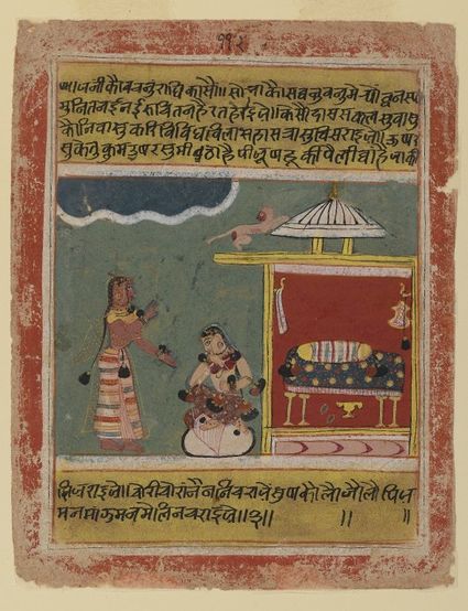
One of the most universally rejected paintings in the Split Second experiment is also one of the most significant from a historical and even political vantage point:

A Maid’s Words to Radha, from a manuscript of the Rasikapriya. Central India, 1634. Gift of the Ernest Erickson Foundation, Inc., 86.227.51.
This painting comes from a manuscript that is important to art historians because it can be dated to a precise year (most early Indian paintings cannot) so it serves as a landmark for dating all other paintings of its type. It’s also in a style that one very influential Indian art historian promoted and popularized as “quintessentially Indian,” a designation that was particularly important in the first half of the twentieth century as India was struggling to gain independence and to re-establish its own traditional culture after centuries of change brought by foreign conquerors. I’m hoping that these facts enhance your interest in the painting, but I’m guessing that they don’t make you like the painting any more than you did before. Because the truth is that it’s kind of crudely painted and you either appreciate its rough simplicity or you don’t. But the fact that you didn’t like it doesn’t mean that I’m going to stop showing it in the gallery.
The one place where we want to give people art that they can instantly like (or at least find engaging) is in choosing the images we use for our advertising. Maybe the results of Split Second can give us some insight into the kinds of Indian paintings we choose for promotional materials in the future. Those images can get people into the galleries and then I’ll take it from there.

Joan Cummins is the Lisa and Bernard Selz Curator of Asian Art at the Brooklyn Museum. Joan received her Ph.D. in 2001 from Columbia University. Prior to coming to Brooklyn, Joan served as Assistant Curator of Indian, Southeast Asian, and Himalayan Art at the Museum of Fine Arts, Boston. Her most recent book is an introduction to Indian painting, published in 2006 by the MFA, Boston. Joan was a Research Associate in Brooklyn's Department of Asian Art from 1991-1993.
