Preparing for User Testing
I was very excited by the prospect of user testing in the field when I started working on the Bloomberg Connects project. As a web developer with a passion for user experience design, I really enjoy watching people as they use technology. How they use a user interface can accurately communicate how well something is working and where the hiccups are.

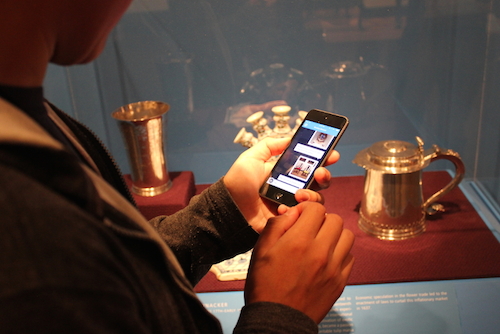
I’m playing the role of a visitor testing the ASK mobile app.
As a part of our process of developing the ASK app, we knew user testing in the museum with visitors was absolutely essential. It allows us as a team to study what our visitors are doing when they use the app and how it might be different from our expectations. We can then use this knowledge, iterate on our product, and deliver an effective experience for the next release.
Prior to user testing with actual visitors, we focussed on testing with team members internally. The goal was to smooth out any kinks with our end-to-end experience and fix major bugs before visitors got to use the ASK app.
A big lesson that we learned in our internal testing is the importance of testing early and often. Our ASK app is composed of many pieces that speak to each other. These pieces are namely: the ASK mobile app, the ASK dashboard (a web interface for the audience engagement team to receive and answer questions), and an API that connects them both. The most effective way for us to test these pieces in sync are by role-playing the experience of visitor and question-answerer. This internal role-playing led us to quickly roll out fixes.

James, our back-end web developer role-playing as visitor and testing the ASK mobile app.
The developers working on the ASK app switched roles frequently during testing so all of us would be familiar with all the pieces. Any time we rolled out a new change, we found ourselves forming small groups to test. We loaded our app on iPod touches, a few people went to our American galleries on the 5th floor and asked questions. Another team member stayed back manning the dashboard answering questions. As more of us used the ASK app as we would in the real-world, we discovered problems very quickly.
The design mock-ups that we referenced to develop the dashboard had failed in filling some important blanks like transitions and button behaviors. Our web designer was able to quickly jump into the code and make edits that made sense in the browser in order to make the dashboard friendlier. Everything was lined up perfectly and clicking around made sense. These changes were absolutely essential for someone using the dashboard so they could quickly see and act on incoming questions.
We discovered inaccuracies with iBeacon in indicating visitor location. In order to figure out what was happening, we added debug and log messages everywhere to see if the problem was with iBeacon, the mobile app, the api, or the dashboard. Jennie, our iOS dev has written a post on how we addressed a lot of our iBeacon woes.
Weaker wifi signal in some galleries would cause messages or images to not successfully deliver to the dashboard. This was one of many bugs that were missed when we tested fixes at our desks.

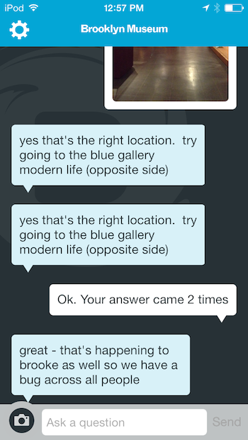
Internal testing of the ASK app resulted in the team using the chat interface to log bugs or notes for discussion.
Users in the dashboard were not able to send messages to visitors if the message was not in response to an unanswered question. This was a limitation that we had built in without realizing and a quick test made it very clear that dashboard users should be able to send messages at any time after a conversation has been initiated with a visitor.
We started noticing latency issues in the dashboard and the api as more people were using the dashboard and mobile app at the same time. This resulted in everything being processed a little slower and inaccuracies at many points. We knew we had to introduce optimizations so things were faster. In some cases of latency, we were able to doctor our interfaces so things felt faster than they were in reality.
We found ourselves using the ASK app as a way to communicate bugs and make notes for testing to discuss later as a team. Most of our problems would have gone unnoticed without an end-to-end test.
After several rounds of internal testing we were ready for a test with real visitors. The first question was—who do we invite? We knew from past projects that our audience is diverse in their use of tech; some are tech savvy, some are not, many own smartphones, but others do not or choose not to use them at the Museum. In previous projects, we had tested with a more exclusively tech savvy audience and this created problems with end products because we were not testing directly with the entire range of our core audience. When testing ASK, we wanted to think about these challenges and test directly with visitors.

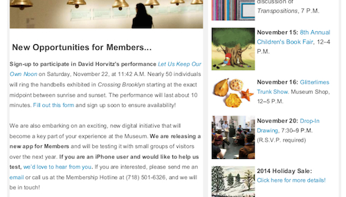
Monthly newsletter inviting members to participate in user testing the ASK app.
Because ASK is designed with our most local visitors in mind, we decided to test with museum members first—those who have a deep relationship with the museum, have been here many times, and have a want to make the visitor experience the best that it can be and are willing to help us do so. Our membership department invited participants in their monthly newsletter and we scheduled our testing groups during the day and evening to attract different audience segments.
We were surprised at how many members answered this call-to-action and that has helped us schedule people through various rounds of testing. We are testing with small groups in our American Identities galleries on our 5th floor. Up next, I’ll talk about what we learned.
Pritika Nilaratna designs and develops user experiences that facilitate intuitive interactions between people and media. As web developer at the Brooklyn Museum, Pritika is focussing on API development and refining user interaction for the Bloomberg Connects mobile application. Pritika has been a resident technologist for the EDesign lab, a growing collaborative of educators and technologists hacking to motivate learners. Her work has been featured on TechCrunch, Hackaday and The Creators Project, and she is a graduate of Parsons The New School for Design.


Start the conversation