User Testing ASK with our Members
Earlier this week I covered how we have been testing the ASK app internally. Today I am going to talk about how we user tested with members who were interested in participating and what we learned.
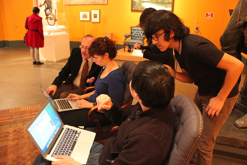
Our web team on the ASK dashboard while one of our test participants testing the app observes “Trade Sign (Boy Riding Bicycle)”
Our first round of visitor testing took place in late October with several small groups of Members. We invited testers into our American galleries on the 5th floor where we were set up. Sara Devine was typing at the dashboard for our chief curator, Kevin Stayton, who answered visitor questions. Each visitor was given an iPod touch pre-loaded with our app. We gave them brief verbal instructions which can be summed up as “use the app to ask any questions you have about our artwork as you wander.” We were careful not to hand-hold or walk them through the interface. The visitors were then free to roam the galleries with our iPods. One reason why we wanted to test in small groups is each visitor was shadowed by a staffer as they used the app and we encouraged them to verbalize what they were thinking/feeling/doing at any point as we logged observations. At the end of each session testers met with the whole team where we posed questions about the entire experience.
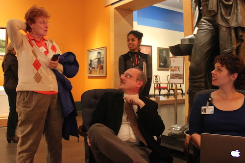
Interviewing our testers on the ASK experience after the test.
The unanimous feedback from visitors who used our app was that the experience is very personal and friendly. Visitors thought that the quality of responses was very high, such that it inspired them to ask better questions. Visitors expressed that they found themselves looking at the art closer so they could ask thoughtful questions. All of these things we had heard from our earliest pilot with iMessage, so we were hoping to see that again with the app that we built specifically for the program. Boom. Nailed it.
We noticed our visitors wandering in a “U” pattern; standing at a work they would ask a question then they would wander close by until an answer was given. Often, once they received the answer they would circle back to the artwork to take another look. We had seen this behavior in the iMessage pilot and were encouraged to see it again. Unlike the iMessage pilot, we found our visitors constantly checking their devices to see if a new answer came. Our test groups resoundingly asked for a vibration alert to notify them of an answer so they could put their device away while without the need to check. iMessage has this built-in, so that’s something that worked from the earlier pilot, but is needed in our own implementation to help encourage the behaviour we want—phones away and looking at art as much as possible.
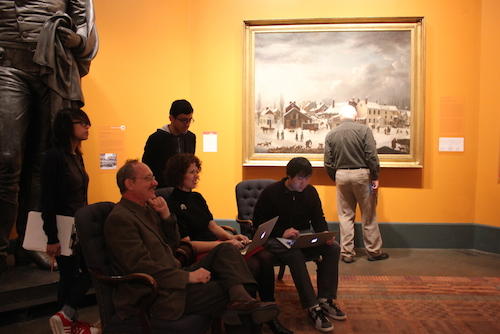
Testers reported (and were observed) looking more closely at works of art often putting down screens in the process. The tester here is a good example – he’s looking at our Francis Guy painting while the mobile device is in his right hand at his side.
We were concerned about the wait time for visitors to get responses from our audience engagement team, in this case, Kevin Stayton. However, our visitors expressed that they didn’t mind the wait because they found the answers to be so high quality that they believed them to be worth waiting for and realized they were being connected to a real person, not an automated system. This is something we will need to revisit as we test with a larger audience because how we scale will be a challenge that we can tackle a number of ways. One idea we have right now is to warn visitors of slow response times during high traffic periods.
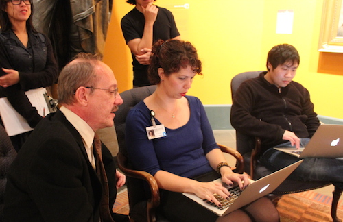
Kevin Stayton, chief curator answering visitor questions with Sara Devine typing them on the ASK dashboard.
Does it matter to the visitor who exactly (staff or curator) is responding to the questions if the answers are good? When we asked testers directly, the answers that we received were that it didn’t matter as long as the answers were perceived as having value often defined as “good,” “worthwhile,” and/or “interesting.” We attempted to A/B test this by introducing our chief curator Kevin Stayton as the question answerer to part of the group, while keeping this a secret from others. This failed when our members recognized Kevin from previous museum visits. We will definitely be looking to test this with larger groups in later phases. When asked, members felt it was not important to be connected to a single voice throughout their visit, but this also something we will need to test as we get a full audience engagement team in place and they trade off in answering questions coming into the queue. While it would be ideal to have the same person on the audience engagement team respond to a visitor, it is not feasible due to our limitations with staffing and/or areas of expertise among the team manning the dashboard.
One of the biggest lessons from our testing was the reveal that our onboarding process is completely broken. We find that visitors skip reading the text on our first screen which has a form to sign up. They repeatedly miss the fields that ask for their name and email, even if there are error messages. They keep clicking our “get started” button in the hope of advancing which prevents them unless they fill out their details. They certainly are not reading why we are asking for this information, which is obscured in the text wall they didn’t read. Additionally, our error messaging was not noticeable enough and they didn’t recognize when they were hitting problems.
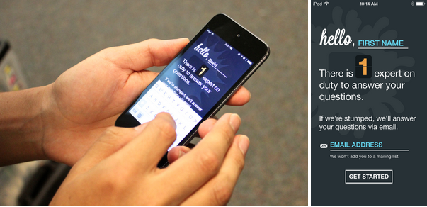
Our onboarding process needs some work and changes to it are the next thing we’ll be testing in early December.
Knowing our onboarding needs a major revision, we are focusing on that for our next round of testing. We are testing new ideas using internal staffers outside of the tech department and will put the best of those in front of members in early December.
Throughout, our initial testing has been with small numbers of people and we are being careful to write everything down and look for trends that we hear across all participants. Tons of great features have been suggested, but until we get many more people using the app in later stages of testing it’s important to simply gather information and identify what is a bug fix and where included features could be improved. In one instance, we saw critical mass when almost every tester expressed a desire in taking their conversation home. From the get go we designed the ASK app to only work on-site, so visitors are asking questions as they are looking at the art. In doing so, we were completely locking the visitor out from seeing their conversation history. We now know that we need to open it up and even though we are seeing that feedback across the board, we may wait on development to do more focus group testing before specific implementation.
Onward! Stay tuned on revisions for our next round of testing.
Pritika Nilaratna designs and develops user experiences that facilitate intuitive interactions between people and media. As web developer at the Brooklyn Museum, Pritika is focussing on API development and refining user interaction for the Bloomberg Connects mobile application. Pritika has been a resident technologist for the EDesign lab, a growing collaborative of educators and technologists hacking to motivate learners. Her work has been featured on TechCrunch, Hackaday and The Creators Project, and she is a graduate of Parsons The New School for Design.


Start the conversation