Agile by Design
As I introduced in a previous post, SITU Studio was brought on board to design a mobile, flexible, and temporary set of furniture components that would allow us to test different configurations in the lobby.

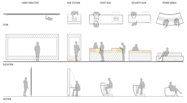
A series of furniture designed by Situ that we could use in a modular and reconfigurable fashion. The design of the components helps differentiate function.
There were several parameters we knew going into the design process:
- We need to be able to clear the lobby and pavilion of furniture for programming or special events on a fairly regular basis, but have no good place to store the furniture elsewhere in the building.
- Security is a required part of the entry experience, but we wanted to somehow make it more inviting, more integrated.
- We have need for a separate information desk, particularly during busy times when admissions staff is focused on ticketing and don’t have as much time to devote to answering general queries.
- The furniture components themselves needed to help communicate that there are different services going on, i.e. the ticketing desks need to look different from the Audience Engagement team “hubs” to help underscore the different functions.

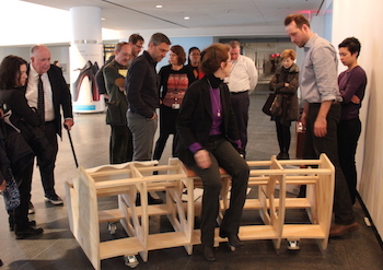
Seeing prototypes in the space has been incredibly helpful.
Throughout the design process, there was much back-and-forth as we hammered out the particulars. As we discussed traffic flow (more in a future post about this) and began to really delve into our needs for the space, we were able to narrow down the components and their functions.
However, finalization of the design only happened after we made the decision to place the ticketing bars in a row against the south wall. This placement was based on previous configurations of the lobby (pre-circular desk) and in consultation with the traffic folks. Turns out that modularity and flexibility only get you so far in planning. You have to put a stake in the ground for that flexible solution to anchor to or there’s no consistency. The ticketing bars themselves are still moveable, but as you’ll see in a future post, we’re centering messaging and traffic flow decisions around this location so while we could move them, we hope they work there.

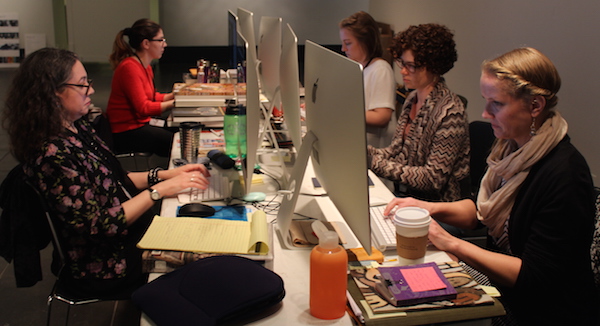
The ASK team is working using a temporary setup, but we’ve found that being together as a team has been important. Often, they need to lean over and ask each other questions.
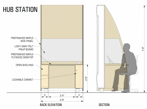
Unfortunately, what we are finding now is that in at least one instance, the furniture is suffering from the same agile fail that Shelley just wrote about. By necessity, furniture design had to progress ahead of staff hiring, which means the hubs as designed may not meet the needs we are now seeing. We envisioned the hubs as individual desks for ultimate flexibility in placement, which means the Audience Engagement team members work individually at their desks. But now that we have the team in place, what we’re seeing is that they work as just that—a team. They are currently at a table together and so far during our app testing sessions, they speak with each other and in some cases crowd-source the answer from among the team members. This will be difficult to do with the current hubs. What’s more, this team process is fascinating to watch. And since one of the main goals of placing the team in the lobby to begin with is drumming up interest in ASK, we can’t ignore the draw of the team’s working process.

The hub design, the place where the ASK team will be working in the lobby, had to be finalized prior staff hiring. The design is reflective of one person working on their own when the reality is they are working as a group.
All is not lost, however, and we are working with the traffic consultants to see how and if we can group the hubs together in a way that works. At the very least we can pair the hubs so team members are always partnered. And although the team works a certain way now, as we continue to test the app, see how visitors use it, and where they are interested in engaging with us around it (might not be in the lobby), the individual hubs may end up being exactly what we need.

Sara Devine joined the Brooklyn Museum as Manager of Interpretive Materials in 2011 and is now Director of Visitor Experience & Engagement. A vocal visitor advocate, her expertise lies in crafting accessible and engaging visitor experiences and reaching audiences across platforms. She works with curators, designers, educators, technologists, and editors on all aspects of visitor experience and engagement. Sara is also a visiting assistant professor and curriculum coordinator at Pratt Institute’s School of Information for their graduate program in Museums and Digital Culture. She was previously Senior Content Developer and Project Manager at Hilferty, a museum planning and design firm in Ohio, where she developed comprehensive interpretive master plans and exhibitions for a wide variety of museums. She has also worked at Assistant Curator, Special Exhibition at Thomas Jefferson’s Monticello and as a Curatorial Assistant at the Smithsonian Museum of Natural History.


Start the conversation