Wikipop iPads and Visitor Metrics
Now that Seductive Subversion has closed, it’s time to look at the Wikipop project and report on what we’ve seen in the galleries over the run of the exhibition. In general, we believe this was one of our more successful interactives in the gallery, but want to remember that this is new and very attractive hardware; many visitors to the gallery reported that this was their first experience playing with an iPad and that alone is enough to boost traffic. With over 32,000 visitors to the show, we had roughly 12,000 sessions on the iPads and that meant that a fairly high percentage of visitors to the show used the devices [and giant disclaimer follows in the next paragraph, so please read it carefully].
I’ll mention there is a lot of possible error with those numbers. For starters, we were seeing that the iPads were overwhelmingly social devices with often more than one person using them at a time, so while we can get a rough idea of sessions, it’s not indicative of how many visitors actually used them or how many of the same visitors may have used more than one device throughout their visit. In addition, there were some anomalies in the stats that had us questioning how we were capturing some of the metrics. That said, it seems better to release what we know and ask you to take these metrics with a grain of salt as we dive deeper into this post.
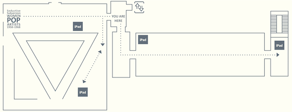
In the exhibition layout, we had three iPads installed throughout the gallery near the works of art to be used while standing in the space. There were also two iPads installed in a seating area at the end of the exhibition. We were curious about possible differences in seating vs. standing metrics, so we were tracking stats accordingly. Units that were placed in the galleries to be utilized standing were overall more popular than the units placed in a seating area at the end of the exhibition. On average, wall units were used for ten minutes with visitors viewing 11.18 wiki articles, while units near seating were used for eight minutes with visitors taking a look at 9.55 wiki articles—again, that’s for the average session with the possibility of multiple visitors per session. We had expected more use at the seated units, so these figures surprised us a bit. I don’t want to jump to too many conclusions remembering that the very end of an exhibition is less trafficked than beginning/middle and it’s possible these numbers wash out in the end, but it may point to visitors wanting the resource near the works of art.
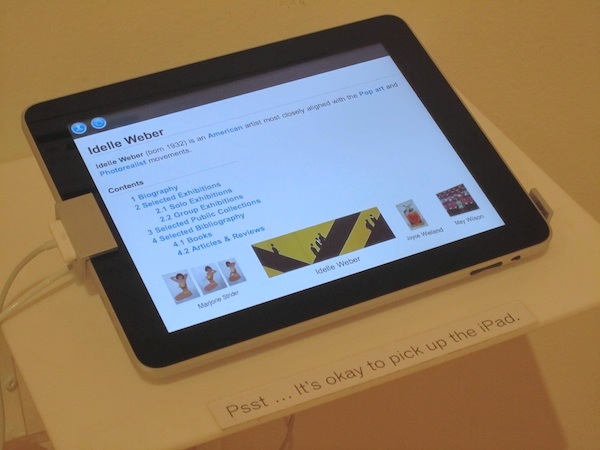
The coverflow app that Beau developed worked very well. Stats indicated that visitors were traversing the entire length of the 26 artists. The artist names were presented alphabetically in the coverflow, but visitors didn’t just click on names earlier in the alphabet, they swiped and clicked on names all over the menu. Interestingly, visitors looked at almost the same artists no matter if they were seated or standing. When you look at the top ten in each category, the lists are almost the identical with the order changing slightly:
top 10 at end of exhibition with access to seating—
Dorothy_Grebenak, Dorothy_Iannone, Chryssa, Jann_Haworth, Vija_Celmins, Marjorie_Strider, Pauline_Boty, Idelle_Weber, Letty_Eisenhauer, Kay_Kurt
top 10 in gallery standing—
Dorothy_Grebenak*, Marjorie_Strider, Jann_Haworth, Dorothy_Iannone, Idelle_Weber*, Pauline_Boty, Chryssa*, Vija_Celmins, Rosalyn_Drexler*, Marisol_Escobar*
In the standing top 10, I’ve included asterisks that indicate artists with work in the show physically near an iPad, possibly changing the stats. Devices were also near objects by Lee Lozano and Kay Kurt, but those two artists did not make it into the standing top 10 list. I’ll note at this point that choice of thumbnail easily skewed stats and, it seems, sex and money still sell in the end—take a look at some of the images used in the coverflow and then revisit the top 10 lists:
On average visitors were looking at 10.66 wiki articles, but given we allowed access to the entire English Wikipedia what were visitors looking at? Across the board, the top 26 articles were exclusively our featured artists; people stayed within our exhibition framework for most of the time. Beyond that, articles on pop art, psychedelic art and Sgt. Pepper’s Lonely Hearts Club Band were universally popular no matter if visitors were seated or standing. (Jann Haworth, one of the artists featured in the exhibition, designed the album cover along with Peter Blake and the link to Sgt. Pepper is in the first sentence of her wiki article, so this makes sense especially given she was in the top 10 on both lists.) What’s more fascinating is to keep looking….visitors who were standing seemed intrigued by articles about other museums. More often that not, a standing visitor would click on articles about Met, Whitney, MoMA, Gugg, New Museum and the list goes on and on to institutions far and wide. (Seriously, other museums should have paid us for in-gallery advertising—it was just that noticeable.) At the seated units, visitors were more likely to browse deeper in subject matter: sexual revolution, pop artist, painting, happenings, WWII, sculptor, surrealism, artist names, etc. Even though our 26 artists were universally popular, we saw lots and lots of statistics pointing to visitors going down the wiki rabbit hole given the opportunity to do so.
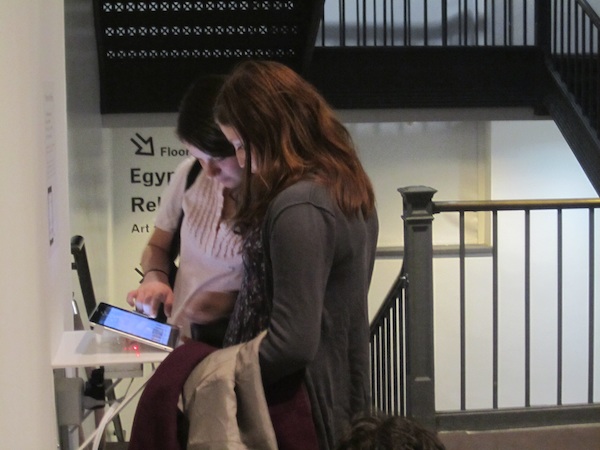
After opening, it became clear that visitors were apprehensive about picking up the device. Even though we copied the Apple store’s display which allows people to pick them up, we found most visitors were using it on the stand instead of cradling the device. After adding some signage guards reported more visitors picking them up, but it’s interesting to remember that in a museum setting old habits die hard and even with iPads people were cautious to touch too much. At this point, I’ll also note that we were using the same alarm system Apple uses in their stores and we never had a visitor attempt to walk away with an iPad. We did have the alarm go off once and we all got a good laugh when we discovered it happened during the press preview as one of the reporters got a little over curious about the setup.
Overall, this project worked well on many levels. A high percentage of visitors utilized the devices for long periods of time going pretty deep into the wiki catalog, but also staying focused on exhibition content. Given most people come to museums with other people, the iPads turned out to be a social device which engaged people in a way that seemed natural to their visit. The information in the wiki articles on these 26 artists is now out in the world via Wikipedia and will contribute to information sharing beyond our exhibition. This leaves us likely to do it again at the next opportunity.

Shelley Bernstein is the former Vice Director of Digital Engagement & Technology at the Brooklyn Museum where she spearheaded digital projects with public participation at their center. In the most recent example—ASK Brooklyn Museum—visitors ask questions using their mobile devices and experts answer in real time. She organized three award-winning projects—Click! A Crowd-Curated Exhibition, Split Second: Indian Paintings, GO: a community-curated open studio project—which enabled the public to participate in the exhibition process.
Shelley was named one of the 40 Under 40 in Crain's New York Business and her work on the Museum's digital strategy has been featured in the New York Times.
In 2016, Shelley joined the staff at the Barnes Foundation as the Deputy Director of Digital Initiatives and Chief Experience Officer.


