Mobile Web
Today we are releasing a mobile version of our website and are happily following in the footsteps of our colleagues at the Powerhouse Museum and the Walker Art Center, who’ve already done so. As Seb and Justin have already expressed, we started to discover through our analytics more and more users with mobile devices accessing our site, so we wanted to make finding and accessing information as easy as possible on the small screen.


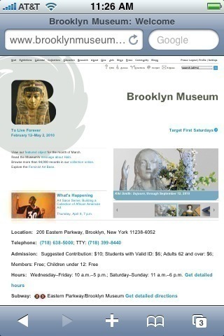
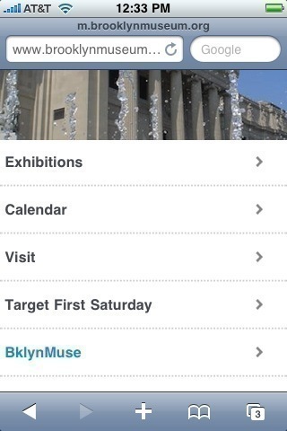
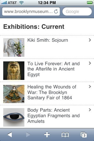
Our native site, above left, renders fairly well on the small screen, but we wanted to slim our presence down to the bare minimum for the mobile version, right. We selected areas with the most traffic—exhibitions, calendar, visit information, Target First Saturday—and made templates that re-render the existing information for mobile.


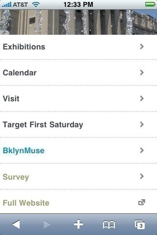
At the most basic level, this is about ease of use for the visitor with the mobile device, but we had other motivations as well. By launching a mobile site, we can automatically detect and redirect when we see incoming traffic via mobile browsers. This means we can put BklynMuse in the menu of selections and make it more visible and easily found. Without this lovely candy shell, redirecting to BklynMuse on its own would have been confusing.

You’ll notice we are color-coding the menu of choices to indicate different types of usage. Dark gray for informational content, cyan for interactive content and dark sage as the catch-all for things that don’t fit in the other categories. Thanks for this idea, Jenny!
The mobile site also allows us to grow and expand easily and I hope you’ll join me back here for some news on that front tomorrow.

Shelley Bernstein is the former Vice Director of Digital Engagement & Technology at the Brooklyn Museum where she spearheaded digital projects with public participation at their center. In the most recent example—ASK Brooklyn Museum—visitors ask questions using their mobile devices and experts answer in real time. She organized three award-winning projects—Click! A Crowd-Curated Exhibition, Split Second: Indian Paintings, GO: a community-curated open studio project—which enabled the public to participate in the exhibition process.
Shelley was named one of the 40 Under 40 in Crain's New York Business and her work on the Museum's digital strategy has been featured in the New York Times.
In 2016, Shelley joined the staff at the Barnes Foundation as the Deputy Director of Digital Initiatives and Chief Experience Officer.
