
Fighting the Three Dots of User Expectation
In my previous post, I talked a lot about agile development and where we failed it. Agile has also thrown us some serious curves in the realm of user expectation. In an agile process, you want to produce a “minimum viable product,” which means sending a product to the floor that is often unfinished and a changeable state. This means making serious choices about what to prioritize in an attempt to not overbuild before your users tell you what they need.
That sounds great in theory, but it rubs up some serious user expectation problems because users don’t know anything about MVP—they just see what we give them and they assess that product based on the technologies they use every day. There are two features in ASK that were a clear user expectation agile collision.
One feature was “the three dots.” You know the three dots, right? If you use iMessage or WhatApp those little three dots appear when someone is typing a response for you on the other end. They are an incredibly important indicator that something is happening and they’ve become the de facto standard in messaging clients. Google handles this a bit differently by saying, “so and so is typing,” but it’s the same feature. The three dots, however, are incredibly difficult to implement and in the early days of our development we decided to table it. Given the complication of implementation and the time it would take, we figured we should let our users tell us if they needed it. They did and they were loud and clear about it.
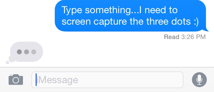
Most messaging clients use the three dots to indicate activity on the other side.
The other feature was the “push to resend.” In this case, if your message does not go through the app usually gives you an indication and then you push, swipe, or pull down to initiate a resend. In the early days of our app, we thought we’d be more helpful. We’d show you an exclamation point indicating a problem with the message and then in the background we’d do some jumping jacks to try and resend ourselves. Users didn’t know what to make of this because every other implementation that they were familiar with did the opposite; the user is required to try the resend and those apps make it a simple push, swipe, or pull down to do so.
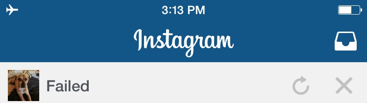
As seen on Instagram, “push to retry” is functionality users have grown to expect.
There’s a careful balance here that we’ve learned from. You want an agile process, but you also need to think about what users are expecting and in some cases you should go ahead and just bake it in. Why? Well because in cases where there’s a high degree of how something should work based on popular example, you can’t fight it. While you can wait (yay, agile), the result is you can end up fighting massive fires when users are frustrated and then you end up needing to push this complicated stuff out quickly.
The other massive learning is don’t try and reinvent the wheel. If something is being used out in the world in overwhelming ways, copy it with the best of them. Anything else is fighting an uphill battle of user training that you just don’t need; we learned this very early on when after a testing session with incredibly frustrated users one member of my team came back into the office asking, “What’s the budget code for therapy?”
User expectation has hit us in other ways not related to agile and this problem is still ongoing as we move the project to the floor. Simply put, visitors don’t seem to expect much from a museum app. I hate to say that, but it’s true. In test after test, we would show them the app home screen and ask what they thought our app did. Without really looking at the screen to assess what was in front of them, they would tell us what they expected a museum app would do. Guess what? They gave us answers about finding exhibition information, events, and playing audio/video. The thought that a museum app might actually do something different was not in the vocabulary.
This says much more about the state of technology in our industry than anything else and it presents us with an uphill battle moving forward. On some days this has left me feeling like we should have gone the route of developing something that had no existing vocabulary, but most days I think this is a darn good fight to have.


Start the conversation