We’re Only Human
When you’ve got any tool that is designed to answer questions the danger is that people think it’s an automated system; with ASK we need to get across very quickly that you’re being connected to real people. This means personalizing the app to a certain degree while not going so far as to create a community. We want the experience through the app to be human and we want that personality to shine through from start to finish.

Comparing the first version of the ASK logo with our latest where we are going a bit more active and less restrained.
This first thing a person sees is our branding and we wanted a look and feel for ASK that reflected a personal touch. Our first attempt, which you’ve seen on this blog quite a bit, used handwriting to convey that personal interaction. In our most recent incarnation—the one we’ll launch with—we’ve taken this one step further. The ASK that you see now has moved toward something a little less restrained and a bit more active; we hope our new ASK is more spontaneous just like the messaging interactions in the app itself.

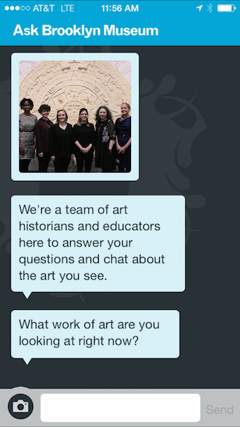
A new onboarding process presents a series of messages that introduce the team.
The next thing we adjusted was the onboarding process. Previous user testing sessions had shown us that our start question—What work of art are you looking at right now?—worked well. Users immediately made a beeline for the nearest object and actively started using the app to answer that question; we didn’t need any instructions or those pesky tutorial screens because the question itself functioned as the tutorial. This question alone, however, couldn’t convey that there was a team of people ready to connect with you about art. While this would eventually be accomplished through the team’s responses to a visitor’s question—all varied and with a personal style—that was coming too late in the game. So, we adjusted the onboarding to include a couple of messages that would introduce the team to the user before the question that gets them started.
Another adjustment involved the protocol of the ASK team. They had already been working with less formal language, but user testing sessions demonstrated how critical that initial contact was. With our first response, especially, the team has been experimenting with a more friendly approach often encouraging the user with “that’s a great question” or providing an indiction of their own personality, “I love that object.” One critical lesson the ASK team learned was to admit when they didn’t know an answer. In some cases, saying “actually, we’re not sure, but we do know this about the object” is better than trying to redirect the conversation without the admission; turns out, admitting when we don’t know is about the most human thing we could do. Subsequent user testings have shown these shifts to be working quite well with testers specifically citing the team’s tone and responses as feeling personal and nowhere near automated. The team continues to do a lot of experimentation around language, directed and open questions, and tests of our start message. Monica will be blogging more about those lessons learned in the coming weeks.

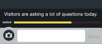
We’ve ditched the scale that indicated wait time in favor of inline messaging.
We have an unavoidably tricky bit with ASK because you are connected to a real person on the other end; no matter what there’s going to be some wait time. The reality is we answer questions as they come in and we can only type so fast. In early days we tried to tell users where they were in the queue—total fail because users didn’t parse the small notification. In a second incarnation we decided to implement a wait scale, but users found this equally confusing and the scale itself felt automated. It was pointed out to us quickly that even the word “queue” made very little sense.

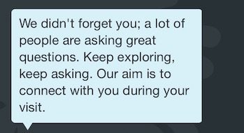
A friendly message is more human; it’s also something users don’t need to learn.
In the end, we switched to inline system messages. If your wait is too long, we’ll fire off a nicely worded system message in the chat. Now, you have an idea there’s a wait, but you don’t have to learn an architecture (a scale, a position number)—the message is something you already know and have been using. A friendly message is just more human.

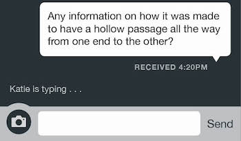
In our case, we’re going with Google’s “so and so is typing” instead of the three dots to reinforce there are real people behind the answers.
In addition to finding a friendly and not-so-automated way to tell you about wait time, we also needed to give users an indication that there was activity going on—that someone is working on a response—and the three dots are what users expect. In our implementation, we’re going the Google “so and so is typing” route and we’ll be using the first name of the ASK team member that you are connected with. This is a great example of pairing the need to be more human with a our technical implementation. By using the name instead of just three dots were solving user expectation and doing so in a way that we hope makes the experience a more personal one.
Some of these changes (and others) came on the heels of a visit from Genevive Bell, who I was fortunate enough to meet at Webstock, where we were both speaking. Genevive was intrigued by ASK and was generous enough to come by to talk with our team and test the app. Her visit came at a pivotal moment for us.

The awesome and inspiring Genevive Bell speaking at Webstock 2015.
We had been testing ASK with small groups and we were just moving into the phase of testing on the floor more widely. During those early testing phases we had been given plenty of feedback from users, but we we were also holding on a lot of implementation in the name of agile. When Genevive came in, she zeroed in on the major issues we had been grappling with and she could articulate those things so clearly that it put much of the earlier feedback from user testing into perspective for us. We were incredibly fortunate in both the timing and the person—thank you, Genevive—because we were inspired to keep solving difficult problems.
I wouldn’t go so far as to say we’ve got all these issues solved, but if feels like we’ve got a decent start.

Shelley Bernstein is the former Vice Director of Digital Engagement & Technology at the Brooklyn Museum where she spearheaded digital projects with public participation at their center. In the most recent example—ASK Brooklyn Museum—visitors ask questions using their mobile devices and experts answer in real time. She organized three award-winning projects—Click! A Crowd-Curated Exhibition, Split Second: Indian Paintings, GO: a community-curated open studio project—which enabled the public to participate in the exhibition process.
Shelley was named one of the 40 Under 40 in Crain's New York Business and her work on the Museum's digital strategy has been featured in the New York Times.
In 2016, Shelley joined the staff at the Barnes Foundation as the Deputy Director of Digital Initiatives and Chief Experience Officer.


Start the conversation