Clearer Choices for Better Flow
Shelley and I like to cast a wide net when looking for inspiration and ideas, often looking outside the museum sector from the customer experience at Apple and Fairway to transparent web design at Southbank Centre. When it came to re-thinking our entry experience, we felt pretty strongly that we needed an outside voice. Inspired by the fascinating data and ideas coming from Janette Sadik-Kahn’s work for New York City, we worked with Situ Studio to hire Arup as a traffic consultant.
The team at Arup would help us evaluate our current traffic patterns, look at the proposed changes and flexible furniture coming in, and help think about pedestrian traffic as part of the project. The goal was to intelligently place the various components and their associated functions—ticketing, security, ASK team hubs—to help visitors navigate the space and understand their options. As we’ve talked about before, exactly how these components work together for the best possible visitor experience is something we need to determine through testing. Arup’s recommended placements are the first set we will test.
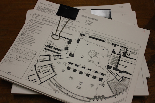
In an early pilot, we tracked visitor traffic patterns in our lobby using pencils and photocopies.
We had a feel for the general traffic pattern in the lobby because one of our early pilot projects involved tracking and timing visitors in the lobby to see what a typical entry sequence was like—where visitors stopped to speak with staff, what path most people take through the space, popular gathering points, etc. Happily, our conclusions matched up pretty well to Arup’s assessment of our existing patterns (score BKM).
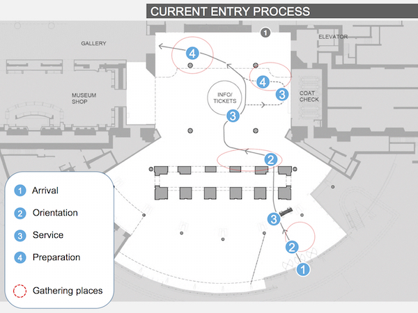
Arup’s version after their own analysis was very similar to what we had found during the pilot.
As I mentioned in my last post, while we were originally aiming to test placement of each component, we ended up having to “fix” the location of ticketing in order to proceed with design. Naturally, this decision also affected traffic planning by limiting the number of variables. Arup was able to focus on how best to move people through the space to ticketing using the info desk, security desk, hubs, and benches as guides.
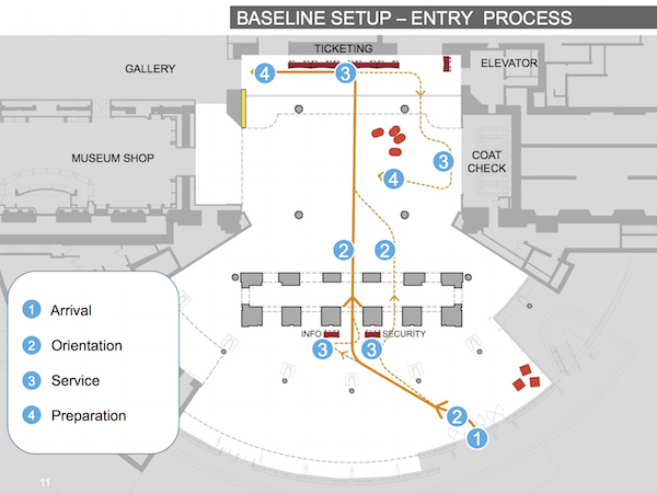
Info and security desk placement will help guide visitors to the center of the brick arcade, so they are lined up with ticketing when they enter the lobby.
A key component of a good visitor experience is clear choices; it’s important for people to see and understand their options. Think of all the questions you ask yourself when entering a museum for the first time–where are the restrooms, where do I get tickets and how much are they, what can I see, etc. Ideally architecture, furniture, and wayfinding, all work together to help visitors understand their options at key decision points. Our architecture is such that there is little (or no) line-of-sight from the main entrance into the lobby. This means visitors have two moments of orientation: one when the enter the revolving doors and one once they pass through the brick arcade. To help with this, Arup focused on clear pathways using security and info desks centered on the brick arcade to draw visitors over. Info is placed ahead of ticketing in case visitors have any questions before they commit to purchasing a ticket. The info and security desks are centered with the goal of drawing people to the center of the arcade so that they enter the lobby through the middle of the space. Once inside the lobby, ticketing is straight ahead.

Movable furniture in the form of power benches and hubs can help further direct traffic. Circles show areas of gathering spaces.
After ticket purchase the next decision point is what to see, so we are placing a new museum directory at a natural gathering spot beyond the point of sale. In another effort to make choices clearer, we moved our previous SHOP/ART/EAT graphic to the doors as we noticed some confusion around which door led to which, particularly since there are two entrance to the galleries. This is one way we’re using graphics to help communicate options; I’ll discuss this a bit more in a future post.
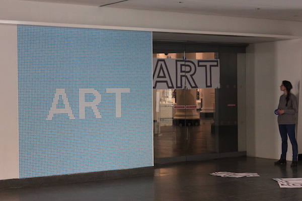
New graphics and adjustments to existing graphics help guide visitors. In the case shown here, our old “art,” “shop,” and “eat” are being moved from walls to the actual doorways. Additionally, they are reoriented higher so they are visible over people’s heads.
A big challenge for us is the fluctuating nature of the space—not only does traffic vary based on exhibition season, time, and day of the week, but we are constantly holding programs, performances, special events, and even film shoots in the pavilion and lobby. We have to be able to adjust set-up based on our needs of the day, but still help visitors navigate the space and this is really where Arup’s insight has been most useful. They have offered us several placement scenarios: a typical day, a busy lobby day (long queuing needs), a busy pavilion day (event), and Target First Saturdays.
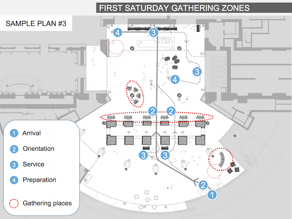
Traffic patterns differ when we need more room for ticketing lines like on busy days or at Target First Saturday. The benches toward the brick piers are the key move here so we can create more room in the lobby proper.
Interestingly, the maximum number of hubs Arup ever recommends placing in the lobby is four, not the full six. Instead, they recommend deploying two hubs elsewhere in the building to take advantage of traffic patterns to special exhibitions and/or other gathering areas in the building for the purpose of reminding visitors about this “thing” they saw in the lobby. This got Shelley’s and my attention since we’ve always wondered a bit if the lobby is too early in the entry experience for really engaging visitors around ASK.
We’ll definitely try Arup’s route—two or four at a time—and see how it goes, but as I said, this is only a first set of placements to try out. We’ll need to adjust as we go and take time to land on the set that works for our varied needs.

Sara Devine joined the Brooklyn Museum as Manager of Interpretive Materials in 2011 and is now Director of Visitor Experience & Engagement. A vocal visitor advocate, her expertise lies in crafting accessible and engaging visitor experiences and reaching audiences across platforms. She works with curators, designers, educators, technologists, and editors on all aspects of visitor experience and engagement. Sara is also a visiting assistant professor and curriculum coordinator at Pratt Institute’s School of Information for their graduate program in Museums and Digital Culture. She was previously Senior Content Developer and Project Manager at Hilferty, a museum planning and design firm in Ohio, where she developed comprehensive interpretive master plans and exhibitions for a wide variety of museums. She has also worked at Assistant Curator, Special Exhibition at Thomas Jefferson’s Monticello and as a Curatorial Assistant at the Smithsonian Museum of Natural History.


Start the conversation