Graphics Tie It All Together
When we first began thinking about the lobby reconfiguration, the need for flexible and moveable was paramount and all of our discussions with the design teams stressed this. SITU Studios took this directive to heart and designed a furniture solution that addressed this need, and MTWTF did the same with graphics that helped communicate the different functions of the furniture. At first we were all pretty excited about MTWTF’s initial design concept. We liked the look and the creative solution to offering a menu of options. We walked away from the first concept presentation pretty stoked.
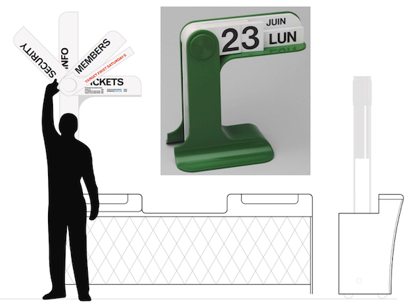
We adored this in concept; taking inspiration from old desk calendars, the signage could be “flipped” to switch to various signs.
Then we reconvened to see scale prototypes. All I have to say is thank goodness for prototyping because once we saw this solution in the space, we quickly realized it wouldn’t work. It was simply too small in scale. We were focused on the furniture and the need for mobility that we neglected to see the bigger role graphics needed to play in the reconfigured space.
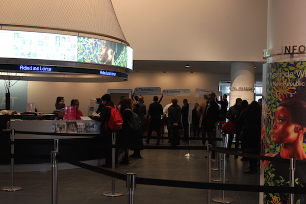
Prototyping revealed that as much as we loved the concept, the reality was too small to see from across a busy lobby.
This reality check caused us all to pause and take a look at the entry experience with fresh eyes. How could graphics help make choices clearer? How could they help us be more welcoming? How could they help fill the space? MTWTF went back to the drawing board with this bigger picture in mind came back with more layered approach.

Large messaging at our entrance identifies where you are. We are using the existing canopy for the additional signage, seen here in a prototype.
Beginning with large messaging at our entrance that says Brooklyn Museum (we didn’t say this anywhere on the exterior previously) and a large “welcome” banner hanging high in the brick arcade. This pairing nicely echoes the welcome sign we have at the north entrance and does a number of things: it confirms that you’re in the right place, adds a nice splash of color to the exterior and for the arcade banners in particular, sends a nice message that doubles as a visual cue to help pull visitors to the center of the arcade {link to traffic post} and through into the lobby.

A welcome sign running throughout the brick piers helps guide you toward ticketing area in the main lobby.
In the lobby, we needed a way make the tall ceilings feel comfortable as opposed to cavernous, so MTWTF proposed hanging large banners from the second floor mezzanine advertising our special exhibitions. These banners, working in conjunction with a painted wall treatment, will draw attention to the south wall, where ticketing will be located, and visually fill the space. A dedicated banner (and ticketing bar) for Membership gives them a larger presence as part of the entry experience.
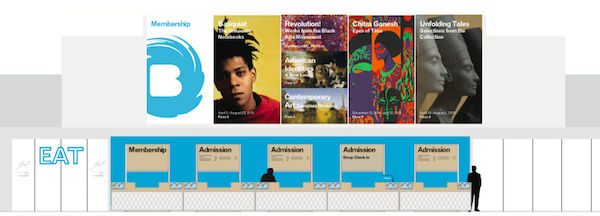
A ticketing area is defined with large exhibition banners and a blue wall to help draw you across the main lobby.
At the more human scale, an updated approach to wayfinding and signs stays true to our need for flexibility and mobility, but provides clearer choices for our visitors. The graphic treatment for shop/art/eat was moved from the wall to the doors in order to help ameliorate confusion around entry points into the rest of the building.
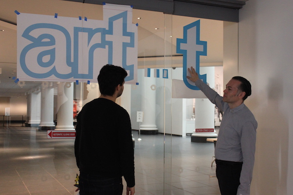
Signage for “art,” “eat,” and “shop” has been moved to the doors for better wayfinding. We also used two color vinyl so the signs will be visible in both day and night situations.
Signs for various ticketing scenarios stacked on stands provide flexibility to change out messaging based on need. Point size for the typeface was selected only after seeing scale print outs in the lobby, so the layers of messaging are clear at the right moments. For example, “Admissions” will be visible for most visitors from the arcade. As they walk closer, the admissions price becomes legible, about the center of the lobby, right at the spot before having to commit to standing in line.
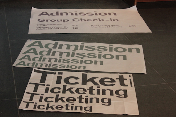
Prototyping included text sizes for admissions signs, seen here.
Finally, we’re working on a new museum directory so that visitors can see all their options at once. The directory itself will be rather large and prominently placed so that it’s purpose is clear from afar, however the listing of what’s on view will require visitors to approach more closely.

A new directory will show visitors all of their options just as before they enter through the “art” doors.
We have left ourselves some flexibility (no surprise there) in that we have the option for larger messaging on the directory as well in order to advertise programs like Target First Saturdays, Thursday Late Nights, and, of course, Bloomberg Connects.

Sara Devine joined the Brooklyn Museum as Manager of Interpretive Materials in 2011 and is now Director of Visitor Experience & Engagement. A vocal visitor advocate, her expertise lies in crafting accessible and engaging visitor experiences and reaching audiences across platforms. She works with curators, designers, educators, technologists, and editors on all aspects of visitor experience and engagement. Sara is also a visiting assistant professor and curriculum coordinator at Pratt Institute’s School of Information for their graduate program in Museums and Digital Culture. She was previously Senior Content Developer and Project Manager at Hilferty, a museum planning and design firm in Ohio, where she developed comprehensive interpretive master plans and exhibitions for a wide variety of museums. She has also worked at Assistant Curator, Special Exhibition at Thomas Jefferson’s Monticello and as a Curatorial Assistant at the Smithsonian Museum of Natural History.


Start the conversation