Split Second Stats #2: Adding Information
Last week I talked about our Split Second: Indian Paintings exhibition and Malcolm Gladwell’s book Blink: The Power of Thinking Without Thinking. In the previous post I described the first section of the online experiment we created for Split Second, and described one of our findings: thin-slicing reduces the positive effect complexity can have on judgment of a work. Today I’m going to discuss another section of the experiment, along with another finding about how people make decisions about art.
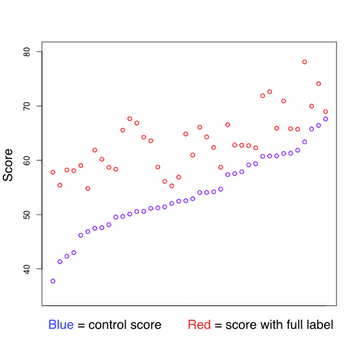
In the Split Second section of the online experiment, participants were asked to pick one of two paintings in less than 4 seconds. We compared the Split Second results with results from a control task, where participants rated images one by one on a linear scale and had unlimited time to make their decisions. Now I’m going to talk about a third task: the “info” task. In the info task, participants were asked to read some information about the painting they were looking at, and then to rate the painting on a linear scale. In the info task there was unlimited time to make decisions. Participants in the info task were split into three groups: one group read the painting’s caption, another read a list of “tags” (single word descriptions), and the final group read a full curatorial label.
Whether or not labels and other additional information help or hurt our experience of art is a point of contention. The cases for and against labels both seem intuitively strong: labels enhance our understanding of the art and its history, but at the same time they can cloud our intuitive reaction to the work, interfering with the purely visual aspects of the “thin-slicing” process as described in Blink. The relevant question, from the perspective of a museum (as opposed to an art gallery) is whether education is at odds with enjoyment. Do educational labels just get in the way of the work itself?
Our data suggest the answer is a decisive “no.” For every painting ratings improved decisively with the addition of information. Adding captions improved ratings by an average of 5 points, tags an average of 6 points, and full labels a remarkable 10 points. Not only do the labels not get in the way of the art, they seem to make people enjoy it even more.
Now, we have a few more findings which complicate this picture:
Captions and tags seem to cause about the same boost in score. At first this was confusing—captions seem to be more information rich, so why weren’t they causing bigger boosts than tags? We think this slightly puzzling result has to do with our choice of Indian art. Unlike much contemporary art, where the title often provides crucial information for interpreting a work, the titles of our Indian paintings tend to be very tag-like, simply describing the work’s content. So, in this case, our assumption that captions were more information-rich than tags may have been incorrect.

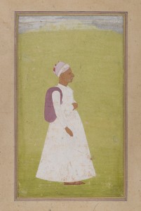
Portrait of an Old Man is a simple painting whose score improved dramatically (20 points) when participants read its full curatorial label.
We found that some works improved much more with the addition of information than others. Images which got low scores in the Split Second and control tasks made the biggest improvements. That is, Split Second scores were negatively correlated with score improvement (cor = -.39, p = .013), as were scores in the control task (cor = -.62, p < .0001). Additionally, as with last week’s story, visual complexity is a significant factor. We found that simpler images reliably got bigger score boosts than complex images (cor = -.42, p = .006). Further, once information was added, the visual complexity of paintings was no longer correlated with their score. That is, the addition of information doesn’t just mute the positive effect of visual complexity, but completely removes it from the picture. This finding suggests that the addition of information about a work changes the process of judgement in a deep, fundamental way, activating an entirely different set of evaluative criteria.
Finally, at the Split Second event at the museum last Thursday, an audience member asked if we found any relationship between between the length of the label and the score. We did find such a relationship, but it wasn’t strong enough that we’re sure that it’s meaningful. We found that the scores given by participants who read the full label were correlated with the length of the label (cor = .28), but that we weren’t absolutely sure that this finding wasn’t due to random chance (CI: -.04 to .54, p = 0.08). The concern is that it may not be the content of the label which people are responding to when they give higher scores, but simply its length. We can’t yet answer this question, but our finding is strong enough (and the question tantalizing enough!) that this certainly suggests a direction for further research.

Beau Sievers is a composer and music cognition researcher. He has a blog. Growing up in the Bay Area, he's been bossing computers around (and vice versa) since the 3rd grade. He is currently working on his PhD at the University of Virginia.


Join the conversation