Asking with a New Set of Eyes
I’m sure it will come as no surprise to anyone that getting out of your own head every once in a while can have great benefits. We’ve been working on ASK for more than a couple of years and we had the unique opportunity to do just that when I got an email from the staff at Cornell Tech that read:

Cornell Tech’s current campus is up and running in Chelsea while it waits for its future home on Roosevelt Island in 2017.
“We are reaching out to invite you to submit a Company Challenge for the fall semester of 2015. Cornell Tech Company Challenges inspire integrated teams of computer science, business, and information science Masters students to deliver new business ideas and prototypes in response to challenges posed by leading startups, companies, and nonprofits. Company Challenges are expressed in the form of a ‘How might we…’ question that goes beyond a problem to solve or work to be done, giving our students the freedom to innovate, explore different paths, and impress you with their creativity.”
The BKM Tech team submitted a couple of ideas and one of the student teams decided to take us up on our offer to find out how might we use data collected from our ASK Brooklyn Museum mobile app to greatly improve the visitor experience at the museum? The Cornell student team—Sean Herman, Daniel Feusse, Gideon Glass, Jean Lin, and Yilin Xu—worked all semester through meetings onsite, a user testing with our visitors, and three studio sprints to come up with a prototype that would address our challenge.
The Cornell team moved through the challenge with a lot of ideas and they decided to run with an alternate entry to the ASK app specifically for those visitors who might not immediately have a question or who may feel intimidated in trying to come up with one. In their project, a visitor could take a photo using a web app and then image recognition would be leveraged to match the photo with existing questions in our ASK dataset. These questions could be used to pique the curiosity of users who could then ask that question as a starting point using the existing ASK app. It’s a nice way to get a conversation started and a bit of an easier onboarding process than having to come up with your own question right out of the gate. Take a look at the demo below.

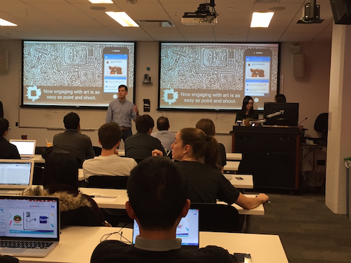
Sean Herman presents about the team’s ASK BKM solution during Cornell Tech’s studio sprint #3.
Now for readers of this blog you might be thinking…”wait a minute this goes against a bunch of what we’ve been reading here” and, you’re right, there are a ton of reasons why our own internal team didn’t go this route. We had developed our own solution knowing the feedback in user testing was telling us that people were looking at works more closely to figure out what questions to ask (behavior we wanted). We were also seeing if we provided too much material people were really interested in these questions, but they got sucked into screens (behavior we didn’t want). Our own experience in past projects had shown us that the more difficult the task (in this case figuring out what to ask), the more deeply engaged the users became, so our current solution was implemented to address all of these things.
But just because we’ve developed things this way and are happy with those results doesn’t mean we’ve 100% hit the mark. The hardest part of working with the student team was actually letting go of what we knew and, instead, letting this group of students go where they wanted to go. Having an outside group try the app and naturally go to this place for a solution was incredibly valuable and, better still, how they decided to execute their own implementation also taught us a great deal, so let’s talk about what we learned.
We’ve reported on the blog about our adoption rate being less that what we want. We hope marketing the app will help fix this (coming in April), but the Cornell team solution had us wondering if we should start playing with alternate entry points to see if it would naturally encourage more use. If so, we could easily start comparing our current engagement benchmarks to new implementations. The idea of doing so in a web based app is a quick way to do experimentation without the need for expensive native development. As things work and engagement is sustained, we could bake these alternates into the app as part of the full experience after it has been fully tested. That’s a big win for us because our default right now is we’ve built a great product that works, so we don’t want to mess with it. This goes against the iterative process we used to make the app in the first place and the Cornell team helped energize us about what’s possible in continuing to hone the experience more as we move through the project.

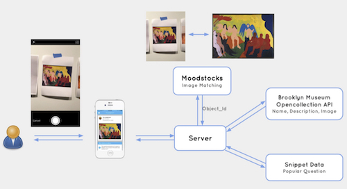
Technical implementation of the Cornell team which included the moodstocks api, our snippet data, and our open collection API.
There are other things we started to think about, too, as a result of the technical implementation the Cornell team used. Could image recognition support our ibeacon implementation? You know we’ve struggled with beacons; the results coming back to the team about where a person is standing have not been reliable. We could start experimenting with a combination of the two to see if we could get better results. Based on the image a person takes combined with probable beacon locations, could the dashboard more accurately predict which object a person is asking about and serve the metadata to the team in a less cumbersome way? Yes, very likely.
We also started to think about the ASK start screen. It’s pretty simple call to action—Ask about art and we’ll answer right now, but that call requires you to immediately have a question. What if we changed that to something more like what you see in the Cornell demo and go with “Take a photo of a work that interests you and we’ll answer right now.” Would that streamline the entry process to something people do naturally (photos) and get them started conversing more easily? This would be easy to test using a paper prototype.

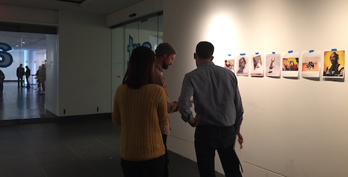
Cornell Team user testing image recognition with BKM visitors.
Lastly, we started to look at the QA model that the Cornell team hints at in their demo and wondered if that could be something we turn on or off during times of heavy load. So, for instance, if the team is flooded with requests and wait times are on the rise, having the app automatically start to provide previous questions and answers might help us scale. The need to scale is a good problem to have and not something we’ve experienced just yet, but that may change as we head into April. Having some thoughts around this now will only help us develop prototypes more quickly if the need arises.
In the end, I think you’ll start to see us taking some of these great ideas and playing with them more. This was a much needed spark for us at this stage of the ASK project and we can’t thank the Cornell team enough for their insight and their work throughout the semester. The ideas they were working with will likely end up being a part of the future of ASK.

Shelley Bernstein is the former Vice Director of Digital Engagement & Technology at the Brooklyn Museum where she spearheaded digital projects with public participation at their center. In the most recent example—ASK Brooklyn Museum—visitors ask questions using their mobile devices and experts answer in real time. She organized three award-winning projects—Click! A Crowd-Curated Exhibition, Split Second: Indian Paintings, GO: a community-curated open studio project—which enabled the public to participate in the exhibition process.
Shelley was named one of the 40 Under 40 in Crain's New York Business and her work on the Museum's digital strategy has been featured in the New York Times.
In 2016, Shelley joined the staff at the Barnes Foundation as the Deputy Director of Digital Initiatives and Chief Experience Officer.


Start the conversation