Location, Location, Location
Last month we had the pleasure of introducing the six members of our audience engagement team, the specialists who will be engaging with visitors via the app. Since then you’ve heard a bit about our training process, how we’re gathering and sharing information in order for the team to feel comfortable and confident about our encyclopedic collection. What we haven’t talked about is where all this is taking place.
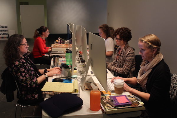
When the team was first brought on board, we created an impromptu work space for them on our second floor mezzanine—a space that is adjacent to the construction area of the second floor galleries and currently off-limits to visitors. If you saw our LaToya Ruby Frazier or GO exhibitions, you’ve been in this space. A little sterile at first, they made it their own with posters, working note boards, and the like, jokingly referring to it as the “command center.” Generally, the space worked well and gave the team a place to gather and gave us a place to hold discussions after app testing sessions.

The ASK team fielding questions using our second floor mezzanine as a temporary office space.
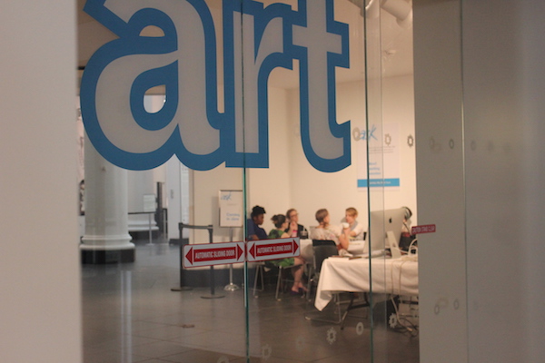
As we approach soft launch of the app and the arrival of the new furniture, the team has relocated to a public area just inside the Great Hall on the first floor. This area is a main thoroughfare for most foot traffic (hence it’s internal nickname “42nd Street”), which admittedly makes it a challenging work environment, but that’s kind of the point. The team will eventually be in the lobby, which can be quite chaotic, so we wanted to give them a transition period in a busier space to start getting used to such distractions. Mainly though, we wanted to make the working process more visible and transparent in order to drum up excitement and anticipation on the part of our visitors. And we’re not the first ones to try this. Southbank Centre did this for their website redesign, though in an even more formal fashion. In true Brooklyn Museum fashion, ours is a little scrappier.

The ASK team has relocated to “42nd Street” to help acclimate them to working in a busy space before their lobby move in June.
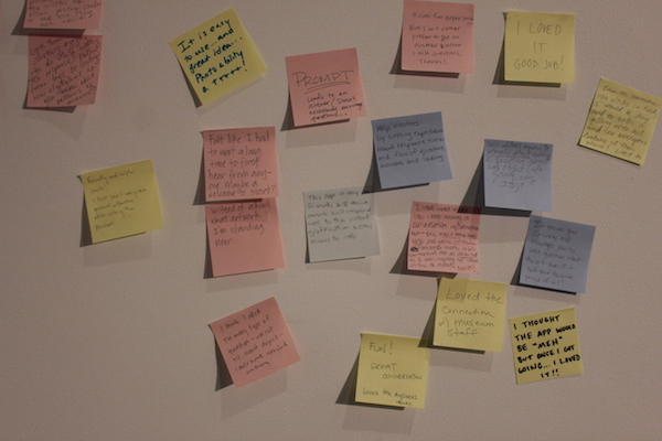
Taking a cue from our colleagues across the pond, we are also advertising our testing sessions and visibly sharing feedback, though for us it’s in the form of sticky notes on the wall,on which we invite testers to write down the one thing we should know from their testing experience. Now, I have a love/hate relationship with sticky notes, as I’ve shared before, but their appeal is undeniable. Testers jump at the opportunity to leave us their thoughts in this way, and the notes have been useful for the team to read as most of them are quite positive and a total morale booster.

What’s the one takeaway we should know from your experience using our ASK app?
It’s interesting to see how quickly this is working. Most visitors walking by automatically slow down a bit to figure out what’s going on and read our sign, even more so during really active periods when the team is answering incoming queries during testing sessions or using the conference table for feedback discussions. I hope this continues to drum up visitor interest and helps acclimate our team to working in a hectic environment.

Sara Devine joined the Brooklyn Museum as Manager of Interpretive Materials in 2011 and is now Director of Visitor Experience & Engagement. A vocal visitor advocate, her expertise lies in crafting accessible and engaging visitor experiences and reaching audiences across platforms. She works with curators, designers, educators, technologists, and editors on all aspects of visitor experience and engagement. Sara is also a visiting assistant professor and curriculum coordinator at Pratt Institute’s School of Information for their graduate program in Museums and Digital Culture. She was previously Senior Content Developer and Project Manager at Hilferty, a museum planning and design firm in Ohio, where she developed comprehensive interpretive master plans and exhibitions for a wide variety of museums. She has also worked at Assistant Curator, Special Exhibition at Thomas Jefferson’s Monticello and as a Curatorial Assistant at the Smithsonian Museum of Natural History.


Start the conversation