Diving into ASK Data
As the Pratt Visitor Experience & Engagement Fellow, I was tasked with conducting a deep dive into ASK-related data. There are several research questions that the team was interested in using the data to answer, which centered around visitor behavior related to ASK, as well as thoughts and attitudes towards the app and experience. In my limited time during the academic year I have focused on the following types of inquiries:
- What kinds of questions do people ask?
- Do questions/comments differ based on nature of artwork (e.g. material culture v. fine art)?
- Where in the Museum do people tend to use ASK?
- How does ASK fit into the gallery experience and overall interpretation options?
My goals for this project are two-fold. First to figure out what can and cannot be learned from the existing dashboard (the interface the team uses to answer questions) and what shortcomings might need to be addressed for future research. The second is to gather and analyze as much information about ASK users related to the above questions within the time constraints of an academic year fellowship.
When I started, my initial focus was on the readily-available data. I started out with the basic metrics accessible in the dashboard to get a feel for what was happening with visitors and the app. This included how many snippets (question and answer pairs) have been created, what objects are most popular, what are the 100 most popular snippets.
Another useful source of data was the ASK ambassador notes. Since the beginning of the Ambassador program in February 2017, the Ambassadors have been making daily notes about their experiences on the floor—what pitches worked and didn’t, people’s reactions, anecdotes and observations. I combed through all of 2017 and 2018 ambassador notes (over 500 days’ worth!) to glean insight into how people received the app and who was or was not receptive. This kind of insight was useful when paired together with the numbers and helped create a better picture. Especially since understanding the behavior of those who don’t use the app is hard to get from app metrics.
Challenges (to name but a few)
There have been many unexpected challenges conducting data analysis with a dashboard not initially built for in-depth data analysis. To start, the metrics available in the dashboard were limiting. For instance, the metrics (how many snippets have been created, what objects are most popular, what are the 100 most popular snippets) do not help me get at some basic understandings such as location of chat or usage variations over time.
The kinds of questions people ask was the most difficult to parse out due to several limitations. When the ASK team processes chats into snippets, they often edit to smooth language or make the content clearer. Snippets were initially the easiest and the only way to look at chat content. This presents two main issues. The first is that I can’t see what a series of questions a visitor asks might look like because their journey is broken apart and only searchable through the pieces (I equate this to trying to figure out the image of a puzzle with just the outside pieces). The second issue is that any kind of sentiment analysis is less reliable. Sentiment analysis could provide insight into users attitudes, opinions and emotions. However, edited text in snippets potentially changes the perception of what the user was thinking or feeling.

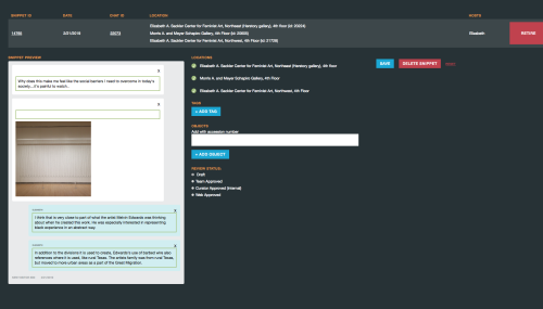
During snippet creation, the team creates question and answer pairs and tags the snippet with accession numbers and key words.
Another challenge was the ability to both export data and combine different kinds of data from the dashboard. There are some metrics that you can export as a CSV, some as a Google doc, and others with no exportability at all. Additionally, the variability between location and collection filters make it difficult to understand what the data is actually representing. For instance: some metrics can be filtered by exhibition or gallery while others are filtered by collection.
The ultimate challenge, however, is the sheer number of snippet content to go through. At the time of writing this post, there have been 19,409 chats and 2,401 objects asked about. It would physically be impossible to go through all of this data as someone coming in only for an academic year, one-day a week.
Luckily, I was able to use creative problem solving (a lot of Google docs and spreadsheets) to work my way around many of these challenges in some way. To learn more about my work-arounds, check out the second half of this post next week.

Sydney Stewart is the 2018/19 Pratt Visitor Experience & Engagement Fellow at the Brooklyn Museum. She is currently pursuing her M.S. in Museums & Digital Culture from Pratt’s School of Information and has previous experience in collections management, exhibitions, visitor research and digital media. Her primary interests are in creating and evaluating the ways visitors can digitally interact with museum collections. Sydney’s current research focus is analyzing user data from ASK Brooklyn Museum.


Start the conversation