Who are we looking for in an Audience Engagement Team?
I’ve just joined the Bloomberg Connects project as the Audience Engagement Lead. I will be heading the team that will be answering inquiries from visitors and engaging them in dialogue about objects in the Museum’s collection.
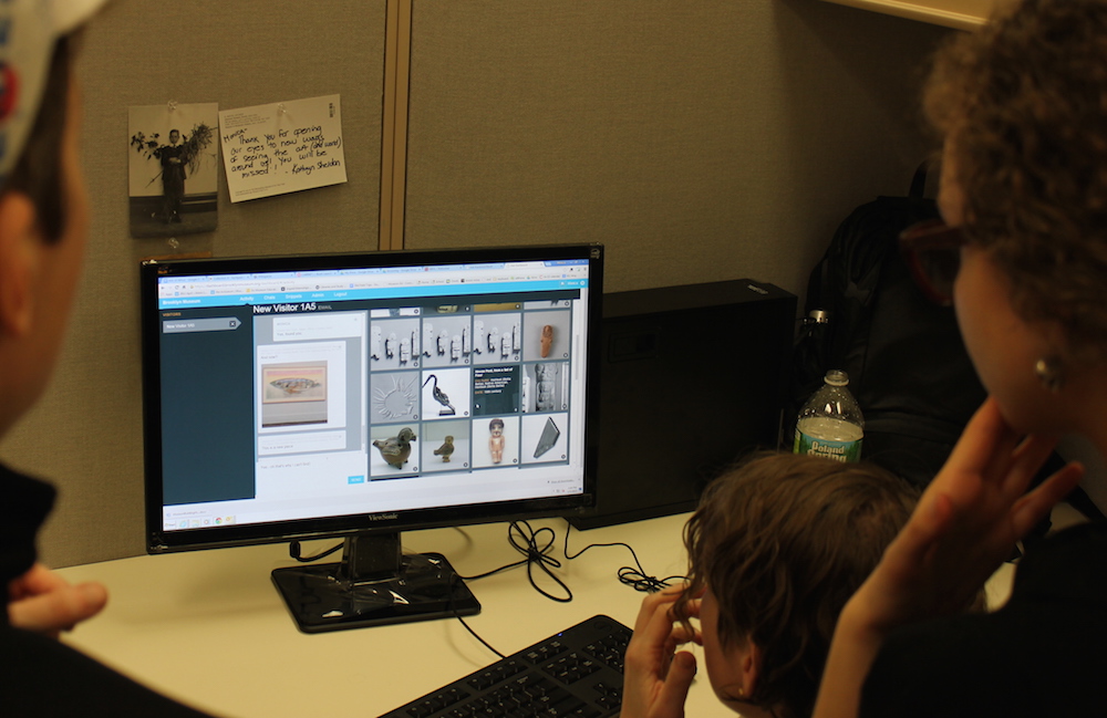
Learning to use the dashboard prior to user testing.
One of my first experiences in the position was to participate in a round of user testing—the largest thus far. It was intense, to say the least. We had thirty-five individuals (from a range of backgrounds) over the course of three hours in our American Identities exhibition asking questions, and sharing their thoughts on objects. Our Chief Curator, Kevin Stayton, was there to answer questions, and Marina Kliger (our new Curatorial Liaison for the project), and I were there to run the dashboard—typing Kevin’s responses to the users, and providing reinforcement by responding to some of the user’s inquiries, and on-the-fly research when necessary. At the end of the three hours our collective heart-rates must have been alarming.
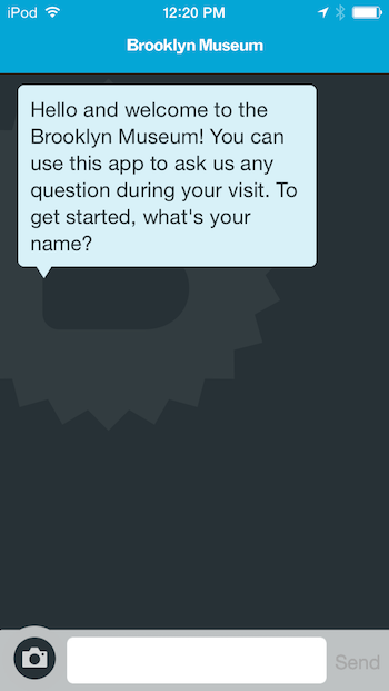
Earlier rounds of user testing used this prompt which felt too automated to users and proved a barrier to their participation.
The first hour was especially stressful. In the first fifteen minutes we received around one question every 30 – 60 seconds. It started with users sending snapshots or titles to artworks in response to the app’s initial prompt, “What work of art are you looking at right now?” The intent of this prompt was to immediately engage the user with the Museum’s collection (and the app) and for us (Kevin, Marina, and I) to follow with a question or information about the object to instigate close looking, or further inquiry about the object on behalf of the user.
As mentioned throughout the blog, the development of this app is being executed through an iterative process. The team had learned during previous evaluations that users found this prompt to be automated, and felt that they needed to craft a smart question, which limited the amount of engagement on behalf of the users. Considering that the prompt created a barrier for the users, we wanted to present the user with an initial prompt that would invite immediate participation. As one of the intended outcomes of this project is to foster dialogue about the Museum’s collection, we decided to begin with the collection.
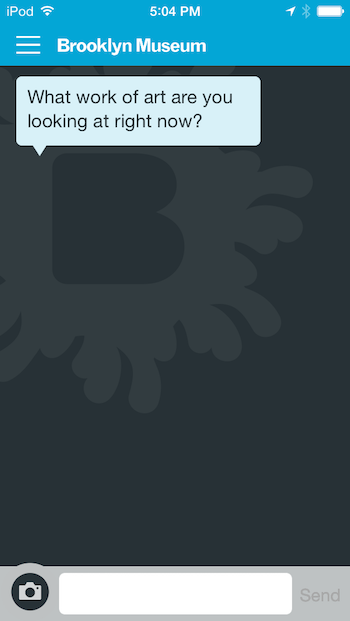
Shifting to this prompt in the latest round immediately engaged users and gives us flexibility in how we respond.
Changing the prompt proved effective in getting the users to use the app immediately. We had twenty individuals registered for the first hour (6-7pm) of testing, and everyone showed up right on time. As we hoped, the prompt instigated immediate engagement with the app once the users entered the galleries. We hadn’t anticipated, however, the stressful situation of receiving a deluge of inquiries at once. Fortunately, we were able to temper the deluge by staggering entry into the galleries for the next two rounds of registrants. We know that we won’t have control of how many visitors will be using the app once it’s live, so we will have to continue to refine the prompt over the coming months to encourage participation, but in a way that’s manageable on the backend.
Our second intent for the new prompt was to encourage further inquiry on behalf of the user by sharing information that could hopefully spark curiosity about the objects and collection. We found this to be true in some of our conversations. For example, the first snapshots that we received was of “Winter Scene in Brooklyn.” We received it and asked each other, “What can we say about this that will get them (the visitor) curious, or have them look more closely?” The object is rich with details—the groups of men in conversation, the man carrying the bundle of wood, the various storefronts—each provide us with a glimpse into the daily life and labor force of early 19th century Brooklyn.
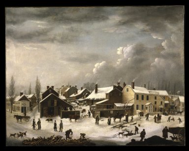
Francis Guy (American, 1760-1820). Winter Scene in Brooklyn, ca. 1819-1820. Oil on canvas, 58 3/8 x 74 9/16 in. (148.2 x 189.4 cm). Brooklyn Museum, Transferred from the Brooklyn Institute of Arts and Sciences to the Brooklyn Museum, 97.13
We had to decide—in a flash—how we were going to engage the visitor with the painting. As we were deciding on the response, a flood of other snapshots and object titles inundated the dashboard—we had to get our first response out so we could attend to other visitor’s who were already waiting. As time was a constraint, we responded first with a general background, “The picture is one of the richest one’s for content and stories,” hoping that this would serve as a teaser for the visitor to look for some of the stories, and content and follow with questions. Which they did (!), their next question was, “I’m curious which portion of Downtown Brooklyn depicts.” Kevin knew the answer immediately, and we responded to the visitor, “This is the area near the Fulton Ferry, low on the horizon, rather than on the hills of the Heights,” and then a few moments later we added, “but none of the buildings in this picture survive.” The visitor again responded with a “thanks,” and “That’s development for you.”
This snippet of one our first conversations from our night of user testing reflects what we’re hoping the Audience Engagement Team Members will be able to accomplish: provide accurate information at a rapid fire pace, framed in a way that instigates closer looking, in a manner that is conversational and hopefully opens further dialogue.
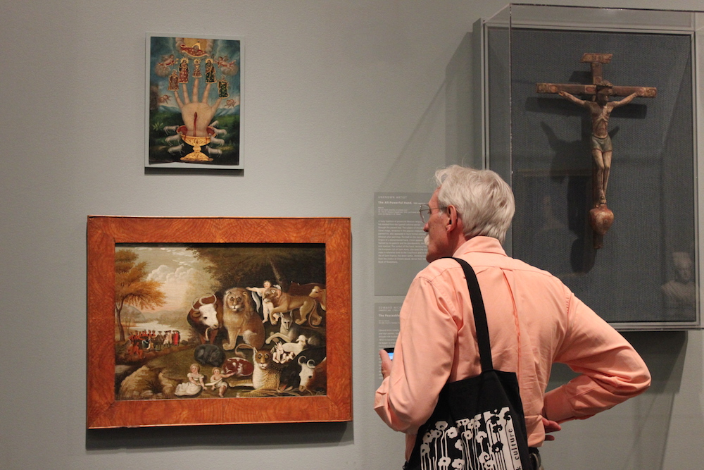
A tester during our last testing session. Engagement through the app encourages closer looking.
We are now in the process of hiring the six individuals who will make up that team. Having the user testing just before the hiring process has provided us with a great insight into what we’re looking for in the Team Members. As I mentioned above, they will need to provide information on the fly, which means that we are looking for individuals with a breadth of art historical knowledge, as well as the ability to do background research under the pressure of time constraints (within minutes!). The level of pressure that we felt with such an incredibly tight time constraint was not something I had anticipated before the user testing—which is great to know when hiring. The ability to stay calm, and personable in a stressful situation will be essential for individuals on the team. In addition to having grace under pressure, and a breadth of knowledge and curiosity to learn more, we’re looking for individuals who are also curious about people, and engaging them with art objects through thoughtful conversation, and the sharing of information.
I envision working with the team as a cohort of individuals who are learning and experimenting together to finding the best ways engage our Museum visitors to the collection using the ASK app. If you know anyone who would like to join the team, send them our way!

Monica Marino is the former Audience Engagement Lead and current School Programs Manager. She is a museum educator with over ten years of experience teaching people of all ages in museums, and training future museum professionals. Over the last ten years Monica has worked in Education here at the Brooklyn Museum, and The Metropolitan Museum of Art. She loves being in discussion with others in front of works of art, and is grateful for the many conversations that have taught her so much about art, and the world.


Start the conversation