Iterating on the ASK Mobile Experience
The ASK mobile app has gone through many design iterations and has continually evolved in a quest to to offer an exceptional user experience. In my user testing post, I had mentioned problems we discovered with our latest design for the onboarding process. Visitors were frustrated and confused by the home screen of the app and unable to jump right in.
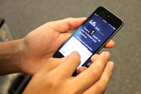
Asking our visitors to jump through hoops before they can start. In this version, a visitor cannot get to ASK without first giving us both, their name and email, bits they often glaze over or avoid.
Visitors were skimming over the name and email address fields, and jumping right to our “Get Started” button, but the app wouldn’t allow them to proceed without these details. Additionally, we had noticed hesitation of some visitors in providing an email address due to privacy concerns and lack of transparency about its intended purpose. In reality we were collecting these details because it would allow us to address visitors by name and also would provide the option of building more advanced features in the future. The way most apps achieve this is by forcing users to create accounts. In early phases of mobile design, as a team we decided to forego often-cumbersome and opaque account creation in favor of an alternative sign-up process for users when they first download ASK. This simpler sign-up was in the form of the name and email address combination that users were asked to provide.
Therefore we realized that even our simple sign-up was causing issues, and as a team we had to question our decision to collect this info at the start and brainstorm yet again how we could transition visitors better into ASK functionality.
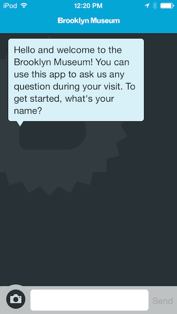
In new version of ASK app, onboarding begins as a conversation with visitors right after they open the app. We delay asking for email address until our audience engagement team is stumped and needs to reach out to the visitor by email.
A following version of the ASK app was designed to allow users to jump right into the functionality and provide their details at a later point. We start the conversation by asking for visitor’s name, which introduces them to the app and also gets them using it. In a future post we will talk in detail about how we are keeping track of visitors and their conversations without forcing account creation.
We ad-hoc tested this screen by itself in our galleries with visitors and found that for the most part visitors would enter their name without any problems. Great! Now we could move on to the rest of the app. As Brian mentioned, the ASK app bundles in informational experience as well. This includes typical content sections such as Exhibition, Collections, Visit etc that our visitors need to be able to access within the same app. Hence we got to designing how these would live in relation to ASK.
We came up with two separate versions of the app home screen. We have added a button for ASK, museum hours of operation, and menu options for the informational sections. The difference in the designs is the treatment of the ASK button. After much debate about the treatments we decided to ad-hoc A/B test the two versions with visitors in our galleries. Our goal was to determine if the pathway to reach ASK was clear to users, which version provided the clearer pathway, and how users reacted to the informational sections.
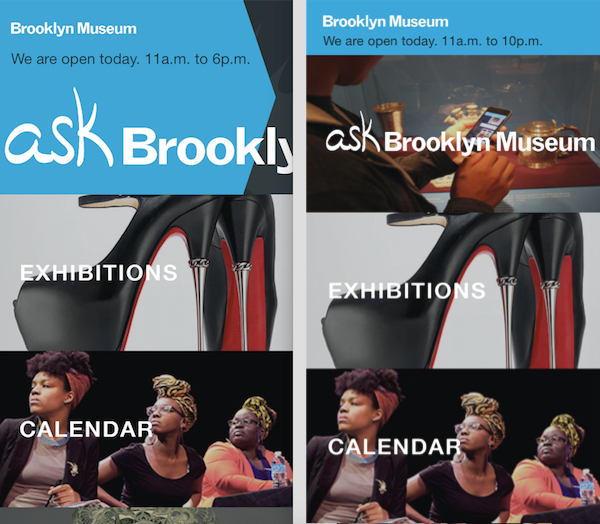
Versions 1 and 2 of our designs for the home screen with more than just ASK functionality. Quick question – how would you get to ASK? Which version is clearer?
In our ad-hoc testing, we followed a very specific script with testers. Our questions were :
- Starting from the top to bottom, go through the app and tell us what you think each section does?
- If you wanted to know more about an object at the museum, how would you achieve this through the app?
- What do you think is the primary purpose of this app?
For the first time we were putting an app in the hands of our users which had a lot more going on than our earlier versions. We wanted to make sure we were getting the answers we needed so we could easily compare between versions 1 and 2.
Much to our disappointment, our test failed, with neither version 1 or 2 working in a satisfactory way. We were amazed to realize that we had made too many assumptions about the user’s experience going into the A/B test. However, we succeeded in discovering some big issues that we had been oblivious to during design.
The number one problem was that visitors did not understand what our app did. 100% of our testing audience assumed that our app was a generic museum app to help them with their visit. In response to our question, “what is the primary purpose of this app?” we got answers like “to bring people into the museum,” “find out what is happening at the museum,” and “don’t know! I would use the website instead.”
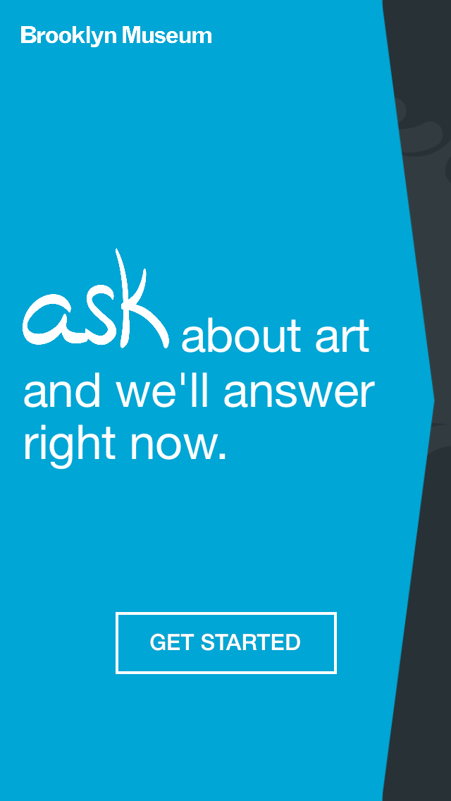
A short, crisp, direct call-to-action that explains ASK is used for answering questions in real-time before leading visitors into ASK functionality.
The second huge problem we discovered is that ASK was overshadowed by conventional and familiar areas such as Exhibitions and Collections. Visitors either ignored ASK entirely or when they did navigate to it, it was not clear to them why they were there, and what ASK was for. We thought our onboarding prompt was perfectly friendly and explicit, however most readers skimmed over or missed what we were hoping to convey and ran back to the familiar sections as fast as they could.
Once again we found ourselves brainstorming how we could put ASK front and center and make its purpose explicit from the get go. Our new home screen design features text that does double duty of acting as a call-to-action in addition to explaining the purpose of ASK.
Finally, in our testing we had noticed that our chat screen prompt had seemed automated to many visitors. They did not feel as engaged with the generic question, and some would glaze over it.
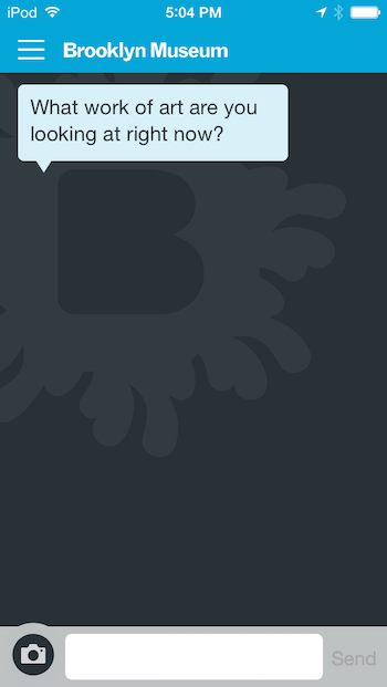
Experimenting with alternative language to prompt our visitors in ASK.
As a test, we changed this prompt to “What work of art are you looking at right now?” This resulted in firstly, lowering the bar for visitors to engage and respond, and secondly, got them walking over and looking at artwork! The change in prompt language made such a huge difference that we decided to make this prompt dynamically alterable by the Audience Engagement team remotely. The changed prompt will be fetched by the mobile app when it first loads. Now the team can experiment with the prompt language to find options that may work in a range of different scenarios.
In our attempt to design the best mobile experience for ASK, we are certain that our design will only continue to evolve. Stay tuned.
Pritika Nilaratna designs and develops user experiences that facilitate intuitive interactions between people and media. As web developer at the Brooklyn Museum, Pritika is focussing on API development and refining user interaction for the Bloomberg Connects mobile application. Pritika has been a resident technologist for the EDesign lab, a growing collaborative of educators and technologists hacking to motivate learners. Her work has been featured on TechCrunch, Hackaday and The Creators Project, and she is a graduate of Parsons The New School for Design.


Start the conversation