Inside Out
The most passionate debates in our office have centered around how we are using geofencing in our upcoming app to present different information to users dependent upon their being outside or inside the building. While we don’t pretend to have this licked, it’s well worth talking about in detail because we’ve just settled on how we’ll implement the feature.

Home screen of the upcoming Brooklyn Museum App. We use geofencing to shift the focus based on your proximity to our building when you are outside (left) and inside (right).
Our app will use the device’s geolocation to serve information accordingly. When a visitor is outside the building, the app will display what we believe visitors are commonly looking for in the form of pre-visit information—hours, directions, exhibitions and events information. When a visitor comes in the building the app will present the ASK activity front and center.

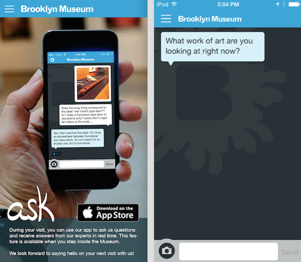
Opening the ASK feature from outside the building (left) and inside the building (right).
ASK, in fact, is only active when someone is in the building—we are specifically not providing this service outside the building. We don’t see our team as a human version of Google and we’ve put our focus on driving engagement toward the collection when someone is standing in our galleries in front of a work of art. If you are outside the building and tap on ASK, you’ll see a splash screen advertising the feature and explaining that it becomes active when you visit us.
There were a few big questions for us, though. The first is the industry-wide trend we are seeing toward multiple apps for single uses. More often than not, people are releasing apps that try and do one thing well. When they want to do something else well, they just release another app focused on that thing. The issue for us is we know there’s already a lot of friction in downloading an app. We don’t think splitting the brand over two apps would be useful to the visitor. We also can’t realistically develop and maintain two apps; that’s not a sustainable path for us.

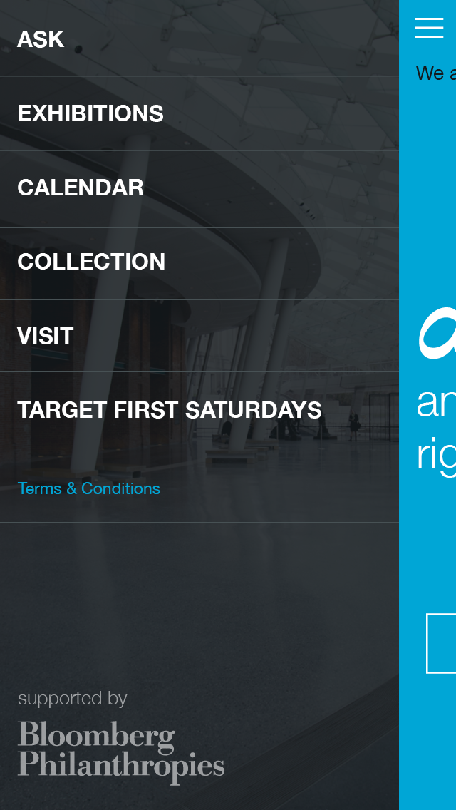
We use the sandwich menu as the consistent element. It’s present both inside and outside and always displays the same information.
So, our task was to figure out how to present both things (pre-visit information and ASK) in a way that allows both to take center stage at the right time, but otherwise keep the two functions as simple as possible. Internal discussion started to zero in on consistency and user expectations as the second big question we needed to answer. Do users expect the app to remain consistent? Will it be confusing to open the app outside the building and see one thing, but find something else when it’s opened at the Museum? We settled on a deploying a sandwich menu in the upper left, which will always stay consistent in both its placement and options.
So what happens if you try and tap on ASK from within the sandwich menu, but you are standing outside the building where the feature is not active? Well, you get an informational screen telling you it’s something you can use when you get here. Internal discussion started to shift toward ASK awareness. How much should we be advertising ASK functionality outside the Museum? We settled on including ASK within the menu, but we decided not to make a big advertisement for it on the home screen people see when they are outside the building. Why?
At first glance you’d think….don’t you want to advertise this ASK thing at all times???? Well, yes and no. If a user’s primary interest before they get here is to figure out when we’re open, what train to take, and what they want to see, then that has to be primary for the users’ sake. The last thing we want to do is make those things harder to find. Also, while you might want to know this is a feature you could use when you get here, it’s pretty doubtful that you’ll remember when your primary focus is this awesome show you want to catch. Lastly, it’s a pretty big downer to be given an option that you can’t do anything with….yet.
So, ASK is in the menu from outside the building and if you poke around and get some awareness about it it great. Otherwise, it takes center stage when you get here and we are going to rely on our entry experience and our team to get visitors focused on the new opportunity that awaits them. As with everything, this is just the path we are taking right now. We are going to learn a heck of a lot when we deploy and things may change as a result. This is one of those features you can’t easily evaluate in user testing until the app is actually out the door.

Shelley Bernstein is the former Vice Director of Digital Engagement & Technology at the Brooklyn Museum where she spearheaded digital projects with public participation at their center. In the most recent example—ASK Brooklyn Museum—visitors ask questions using their mobile devices and experts answer in real time. She organized three award-winning projects—Click! A Crowd-Curated Exhibition, Split Second: Indian Paintings, GO: a community-curated open studio project—which enabled the public to participate in the exhibition process.
Shelley was named one of the 40 Under 40 in Crain's New York Business and her work on the Museum's digital strategy has been featured in the New York Times.
In 2016, Shelley joined the staff at the Barnes Foundation as the Deputy Director of Digital Initiatives and Chief Experience Officer.


Start the conversation