Messaging is Harder
Perhaps its the nature of an agile project, or just this agile project, but at each stage of ASK Brooklyn Museum we find ourselves facing new, sometimes unforeseen challenges. And if we thought launching this thing was hard, messaging has been even harder. For some weeks now we’ve been trying to determine how to talk about ASK—what’s the hook for people? How does that translate to in-building messaging like palm cards, gallery labels, advertising? How does that inform how we talk about it both inside and outside the building? I can say without a doubt, in my 10 years in the field, this project has been the most difficult one in terms of determining messaging.
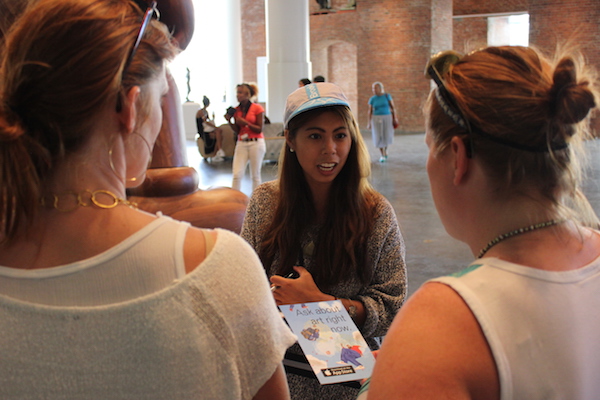
With the help of our newly hired Visitor Liaisons (more on them in my next post), we spent time on the floor speaking with visitors, doing voting exercises of key phrases, and testing palm card variations. The challenge here is that we need to let people know we have an iPhone app and we need to explain the function. Of the two, the messaging around function is proving to be the most difficult task. As Shelley introduced earlier, there are enough museum apps out there, that visitors conjure a particular experience and in our testing we are finding it’s almost impossible to get across anything else.
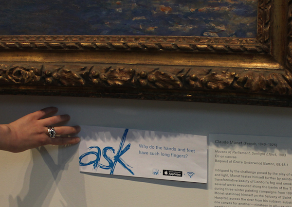
In looking at our first challenge—letting people know we have an app—our first attempt at messaging included a combination of three icons, a logo triplet that consisted of our app icon plus the Apple download logo plus the wifi symbol. We thought this was pretty clear so we rolled it out on the floorplan, directories, and our first round of gallery labels.

Our first round of labels paired with objects included our triplet, but in the end we found the Apple download button on its own did the job and had more clarity.
It was pretty clear pretty fast that we didn’t need the app logo or the wifi symbol. The Apple download logo instantly got across to visitors that the label had something to do with an app. In fact, it’s all the needed. Subsequent tests in various formats have proven that pretty much without-a-doubt. This was just another reminder that is makes the most sense (and least effort) to tap into existing icons, messaging, or brands whenever possible as opposed to reinventing the wheel. Apple’s already done the work for us.

We tested each round of our palm card with 10 visitors (or groups of visitors) to spot trends, took what we learned from that version, and tweaked it.

We might have gone a little overboard in our palm card layout testing. We didn’t end up needing to test all of these as sometimes testing one ruled out several.
With the first issue solved, we moved on to testing messaging about the app’s functionality. From our early app development testing, our beta testing, and the work of our Liaisons, we felt like we had a handle on the components of ASK that most people responded to—that it’s real people, that it’s in real time, and that it’s personal. So we did a blind voting exercise of some taglines based on these ideas, including “ask us about art right now” and “real answers from real people.”
In the end, both ideas proved equally compelling, so we moved on to testing palm cards with these phrases and associated imagery. We learned some pretty important things:
Images are the first thing people respond to. No one liked any of the versions without images, regardless of content, but at the same time, the image could work against us. We (stupidly) tried a layout featuring Terri Greaves’ beaded high-heeled sneakers, only to immediately confuse visitors because they (naturally) though the palm card was advertising our “Rise of Sneaker Culture” show. Duh. When we switched the image to Georgia O’Keefe’s Brooklyn Bridge, visitors assumed the card had to do with Brooklyn. An image of an African Power Figure had people thinking it was about the collection, and one of a Kehinde Wiley painting that it was about hip-hop. Sigh.
People were not reading. Evaluation has shown us that while a lack of reading isn’t always true of our object labels, it was pretty consistent for our palm card testing. We included some text in an attempt to explain how the app works (something people asked for), but over the course of testing we simplified the language from examples of Q&A to a basic description (a single phrase!) and still no one read.

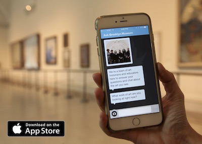
Front of card with app in situ showing onboarding screen.
The final card has a single shot of the app being used in the gallery on the front with the download button; on the back very simple messaging about what it does. With this card, everyone knew it was an app right away, but there’s still a lack of clarity in what the app does because of preconceived notions of what a museum app is. We heard things like:
“It’s an advertisement for museum app. The app gives you information on the museum.”
“The card is an app advertisement. It helps find different pieces of art, is a map, and is also a description of art and the history of art.”

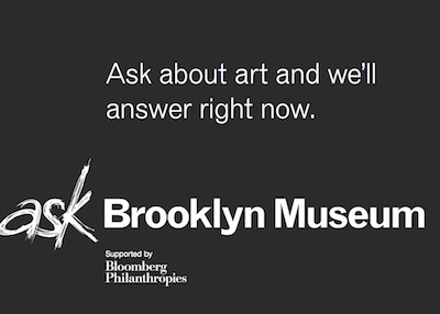
The back of the card with simple messaging.
Despite our ongoing frustration with this issue, we think it will be ok because we plan to hand out this card mostly as part of an in-person explanation of the app. The other reason we think this will be ok is because it has to be. We’ve pretty much decided to give up fighting people’s expectations (it’s a losing battle) and instead work on surpassing them. After all, the moment users figure out they’re messaging with a real person is the “wow” moment. And who doesn’t want to be wowed?

Sara Devine joined the Brooklyn Museum as Manager of Interpretive Materials in 2011 and is now Director of Visitor Experience & Engagement. A vocal visitor advocate, her expertise lies in crafting accessible and engaging visitor experiences and reaching audiences across platforms. She works with curators, designers, educators, technologists, and editors on all aspects of visitor experience and engagement. Sara is also a visiting assistant professor and curriculum coordinator at Pratt Institute’s School of Information for their graduate program in Museums and Digital Culture. She was previously Senior Content Developer and Project Manager at Hilferty, a museum planning and design firm in Ohio, where she developed comprehensive interpretive master plans and exhibitions for a wide variety of museums. She has also worked at Assistant Curator, Special Exhibition at Thomas Jefferson’s Monticello and as a Curatorial Assistant at the Smithsonian Museum of Natural History.


Start the conversation