Timing is Everything
One of the things we learned from ERm’s evaluation was that ASK users really appreciate when the responses to their questions are well timed (i.e. before the person has walked away from the work of art) and of the right length. As you might imagine, this poses a bit of a challenge for us since there is no one-size-fits-all approach to these ideas, particularly the idea of “right” length.
We noticed the timing challenge early in beta testing after watching testers impatiently hovering by the works of art waiting for an answer. To address this, the ASK team starting letting users know they could walk around and the app would ping them when the response was ready. This overt permission to walk-away worked so well that we baked it into the app. It’s one of the few auto-fire messages user receive.

Users really needed to be “released” from the instinct of waiting by the artwork they asked about and reminded to look around.
While this auto-fire helps quite a bit (at least one focus group participant noted the usefulness of that permission), “fast” responses are something users seek and we aim to provide. Afterall, seconds feel like an eternity when you are watching the three-dots. Once timing was brought up by ERm, I did a little metric research to see what our response time has been over the course of the project and I was surprised to learn that it’s gotten slower. For the first 6 months of the project, the team was averaging 0.89 minutes for an initial response time and 1.15 post start wait time. They were responding in under a minute. That’s pretty darn fast. However, over the course of the next year, response times increased to 1.36 minutes for initial response and 1.36 for post start wait time.
As Jessica and I discussed this phenomenon, it dawned on us that the faster response times correspond to the busiest times on the app. When the team is slammed, they don’t have as much time to carefully craft responses and they do when the dashboard is slower. Their answers can be more leisurely. Additionally, at the request of the curators, the team had started provided a rather formulaic first response to users than included the artist name and title of the work. Naturally, this takes time to type out in addition to any time required to answer the person’s question.
We reviewed the response times as part of discussions with the ASK team about how to address ERm’s recommendations and came up with some solutions. One solution was to eliminate the formulaic first response. Not only does it take time, but it also felt very canned and was likely contributing to confusion about the nature of the exchange (bot or human) also noted in the evaluation. Excellent.

We tested different message lengths, eventually settling on about 200 characters per message and breaking up longer thoughts into multiple text messages.
The second solution was to focus on shorter responses, particularly at the beginning of the conversation. This would also address the “right” length challenge. While we may not know exactly how much information each individual user wants, we do know that sending users a large text bubble can be a turn off. After some simple testing, we determined that approximately 200 characters was a text bubble length. The ASK team aims to send no more than three messages in a row at that length early on in the conversation. We’ve found that as the conversation continues, the team gets a feel for how much info someone wants and longer text bubbles are often welcomed.

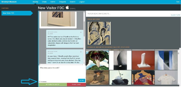
A running character count in the bottom left of the text field helps team members keep responses short.
At first, the team just eye-balled the response length in the dashboard window while we confirmed our 200 character limit. Then the Tech team made updates in the dashboard so that there is a running character count. This is helping: since we made these changes, the team is averaging 1.28 initial response time and 1.06 post start wait time.
Since we haven’t yet attained our original speed, we could go a step further and either limit characters in the dashboard text field or set some kind of response count down timer to approximate that external pressure of a busy dashboard. The former seems too regimented, particularly since we know sometimes longer responses work very well. The latter seems more appropriate, but I’m hoping that we’ll be busier soon anyway (more to come in future posts) and we won’t need to approximate pressure, we’ll have the real thing instead!

Sara Devine joined the Brooklyn Museum as Manager of Interpretive Materials in 2011 and is now Director of Visitor Experience & Engagement. A vocal visitor advocate, her expertise lies in crafting accessible and engaging visitor experiences and reaching audiences across platforms. She works with curators, designers, educators, technologists, and editors on all aspects of visitor experience and engagement. Sara is also a visiting assistant professor and curriculum coordinator at Pratt Institute’s School of Information for their graduate program in Museums and Digital Culture. She was previously Senior Content Developer and Project Manager at Hilferty, a museum planning and design firm in Ohio, where she developed comprehensive interpretive master plans and exhibitions for a wide variety of museums. She has also worked at Assistant Curator, Special Exhibition at Thomas Jefferson’s Monticello and as a Curatorial Assistant at the Smithsonian Museum of Natural History.


Start the conversation